    graph LR
    subgraph Data Science Initial Exploration
    A((Subject Mater Understanding <br> Define the Question))-->B((Data Gathering <br> Mining <br> Ethical Qusetions ))
    B-->C((Data Cleaning <br> Wrangling))
    C-->D((Data Exploration <br> Visualization <br> Exploratory Data Analysis))
    end

    subgraph Data Science Modeling
    D-->E((Feature Engineering <br> Data Preparation))
    E-->F((Predictive Modeling))
    F-->G((Data Visualization <br> Communication <br> Sharing))
    end
    G-->A

    style D fill:#f9f,stroke:#333,stroke-width:4px
    style G fill:#f9f,stroke:#333,stroke-width:4px
Introduction to Data Science
Data and Visualization
Important Information
- Email: joanna_bieri@redlands.edu
- Office Hours: Duke 209 Click Here for Joanna’s Schedule
Announcements
Please come to office hours to get help!
I can be REALLY FLEXIBLE with deadlines in the first few weeks of class, so if you run into technology issues please don’t panic.
Day 3 Assignment
- Make sure Pull any new content from the class repo - then Copy it over into your working diretory.
- Open the file Day3-HW.ipynb and start doing the problems.
- You can do these problems as you follow along with the lecture notes and video.
- Get as far as you can before class.
- Submit what you have so far Commit and Push to Git.
- Take the daily check in quiz on Canvas.
- Come to class with lots of questions!
The Data Science Lifecycle
Doing data science consists of a full cycle of steps as outlined in the diagram below. In this class we will explore each of these parts. Today we are talking about Data Visualization, which can take place in two different areas of the lifecycle.
Some important things to keep in mind:
- It is your job to make sure your results are reproducible. This means that someone else could follow your work and get to the same conclusions.
- It is your job to really get to know your data.
—————————
Data and Visualization:
Today we will approach visualizatoin from the Initial Exploration side of the diagram. Given a data set we want to do a little bit of Exploratory Data Analysis - EDA
“The simple graph has brought more information to the data analyst’s mind than any other device.” — John Tukey
- We want a visual representation of the data.
- In python we will use Plotly.
We will do this by exploring the Star Wars Characters data set:
This lab follows the Data Science in a Box lab “Visualizing Star Wars Characters” by Mine Çetinkaya-Rundel. It has been updated for our class and translated to Python by Joanna Bieri.
Load the Data
import numpy as np
import pandas as pd

import matplotlib.pyplot as plt
import plotly.express as px
from plotly.subplots import make_subplots
import plotly.io as pio
pio.renderers.default='colab'

from itables import show
file_location = 'https://joannabieri.com/introdatascience/data/starwars.csv'
DF = pd.read_csv(file_location)show(DF)| name | height | mass | hair_color | skin_color | eye_color | birth_year | sex | gender | homeworld | species | films | vehicles | starships |
|---|---|---|---|---|---|---|---|---|---|---|---|---|---|
|
Loading ITables v2.1.4 from the internet...
(need help?) |
Data terminology
- Each row is an observation
- Each column is a variable
Lets look at one observation of a Star Wars character:
** NOTE: I gave the data the “nickname” DF, the variable DF references my data.
observation_name = 'Luke Skywalker'
# Select just the row where the name equals Like Skywalker
DF[DF['name']==observation_name]| name | height | mass | hair_color | skin_color | eye_color | birth_year | sex | gender | homeworld | species | films | vehicles | starships | |
|---|---|---|---|---|---|---|---|---|---|---|---|---|---|---|
| 0 | Luke Skywalker | 172.0 | 77.0 | blond | fair | blue | 19.0 | male | masculine | Tatooine | Human | A New Hope, The Empire Strikes Back, Return of... | Snowspeeder, Imperial Speeder Bike | X-wing, Imperial shuttle |
Q How would you update the cell above to search for a different character? Make a change to the code above to find information about C-3PO.
Q In the data for C-3PO one of the entries says NaN. What does this mean?
Q Look at some observations for other characters. Just choose a few different names and see what their data says.
Q What happens if you spell a name wrong or forget to capitalize?
Q Check out each of the variables (columns):
- What does each column tell you?
- Is the data a word or a number or something else?
- If the data is a number, what are the units?
Information about the Data
Every good data set should come with some information about what the variables are and sometimes how the data was gathered. Here is the information for this data set:
- name
- Name of the character
- height
- Height (cm)
- mass
- Weight (kg)
- hair_color,skin_color,eye_color
- Hair, skin, and eye colors
- birth_year
- Year born (BBY = Before Battle of Yavin)
- sex
- The biological sex of the character, namely male, female, hermaphroditic, or none (as in the case for Droids).
- gender
- The gender role or gender identity of the character as determined by their personality or the way they were programmed (as in the case for Droids).
- homeworld
- Name of homeworld
- species
- Name of species
- films
- List of films the character appeared in
- vehicles
- List of vehicles the character has piloted
- starships
- List of starships the character has piloted
Information about how much data we have
We often want to know how many rows or columns our data has. This can help us know if we have enough data for certain analyses or models.
# Number of Rows - Observations
print(len(DF))87# Number of Columns - Variables
print(len(DF.columns))14# Total dimensions of the data
print(DF.shape)(87, 14)So with these commands we have learned that the data has 87 observations and 14 variables.
Exploratory Data Analysis (EDA)
Now we will start really analyzing the data! This might consist of 1. Summary Statistics 2. Visualization (Today’s Class) 3. Data Wrangling (Future Class)
EDA takes a bit of creativity and the ability to ask questions of the data. It helps that we got to know our data a little bit above.
Mass vs. Height
How would you describe the relationship between mass and height? What do we expect? Taller characters have (more? less?) mass? Which characters are outliers, aka are very short but have large mass?
Let’s start with a graph:
fig = px.scatter(DF,
                 x='height',
                 y='mass',
                 title='Mass vs. Height of Starwars Characters')
fig.show()
Q What do you notice about this graph? Are there any strange data points?
Let’s add some data so when we hover over the point we can see the characters name:
fig = px.scatter(DF,
x='height',
y='mass',
title='Mass vs. Height of Starwars Characters.',
hover_data='name')
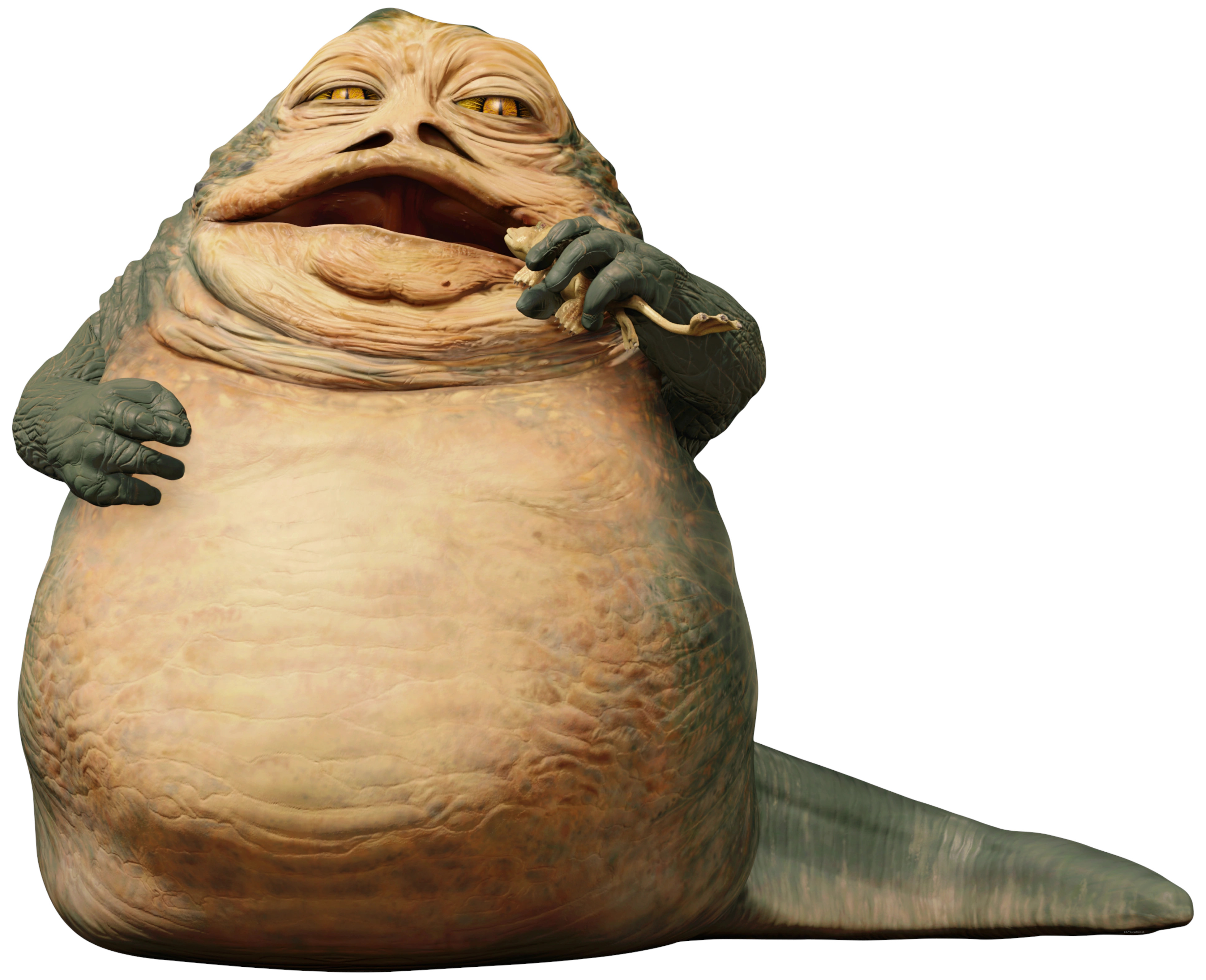
fig.show()It was JABBA the HUT!
- name = “Jabba Desilijic Tiure”
Let’s take a closer look at this code:
    px.scatter(DF,
             x='height',
             y='mass',
             title='Mass vs. Height of Starwars Characters.',
hover_data='name')- px tells Python that you want to use plotly (this is a module that contains lots of awesome graphing abilities)
- .scatter tells plotly that you want to do a scatter plot
- the parenthesis () send information to the scatter function. What data to we send?
- DF - is the dataframe - this is the name we gave our data set when we imported it.
- x=‘height’ says that we want to plot the column named height as the x variable
- y=‘mass’ says that we want to plot the column named mass as the y variable.
- title lets us give the overall graph a title
- hover_data=‘name’ says that we also want to know the information in the name column when we hover over the data.
You try birth_year vs mass
Q See if you can figure out how to make a plot of the birth_year vs mass with the hover data being the name?
—————————
Why Visualize?!?!
Here is a great example data set for why we visualize our data.
For this data set we are going to first do some summary statistics to see how different the variables are.
** Note I will give this data set a new name DF_new. If I named it the same thing as I named the Starwars data it would overwrite that data.
# Load the data
#| label: Download data
#| warning: false

file_location = 'https://joannabieri.com/introdatascience/data/Anscombe_quartet_data.csv'
DF_new = pd.read_csv(file_location)

# Some code to make the data frame look nicer
DF_new = DF_new.drop(['x4'], axis=1)
DF_new.rename(columns={'x123':'x'}, inplace=True)show(DF_new)| x | y1 | y2 | y3 | y4 |
|---|---|---|---|---|
|
Loading ITables v2.1.4 from the internet...
(need help?) |
Here x is the x-value that we would plot in a scatter plot and we are given four different possible y-values. The bug question is:
How different should these plots look?
Summary Statistics
Pandas can do all sorts of statistics for us really quickly using the .describe() function!
DF_new.describe()| x | y1 | y2 | y3 | y4 | |
|---|---|---|---|---|---|
| count | 11.000000 | 11.000000 | 11.000000 | 11.000000 | 11.000000 |
| mean | 9.000000 | 7.500909 | 7.500909 | 7.500000 | 7.500909 |
| std | 3.316625 | 2.031568 | 2.031657 | 2.030424 | 2.030579 |
| min | 4.000000 | 4.260000 | 3.100000 | 5.390000 | 5.250000 |
| 25% | 6.500000 | 6.315000 | 6.695000 | 6.250000 | 6.170000 |
| 50% | 9.000000 | 7.580000 | 8.140000 | 7.110000 | 7.040000 |
| 75% | 11.500000 | 8.570000 | 8.950000 | 7.980000 | 8.190000 |
| max | 14.000000 | 10.840000 | 9.260000 | 12.740000 | 12.500000 |
Here we see the following information: * Each variable is represented at the top of the table and has the following statistics: + count = number of observations + mean = average value + std = standard deviation + min = minimum value + 25% = Q1 first quartile + 50% = second quartile or median = middle observation + 75% = Q3 third quartile + max = maximum value
If we just look at the average or mean, what we notice is that y1, y2, y3, and y4 all have the same AND they have basically the same standard deviation… so maybe the graphs will look the same?
If you have had a statistics class you might also look at the median values which are slightly different, but still, how different do we expect theses graphs to be?
Visualization
Make a scatter plot for each of the y-values. Here is the first one:
fig = px.scatter(DF_new,x='x',y='y1',title='x vs y1')
fig.show()
Q Now you make the other three plots! What do you notice? Are they all the same?