import numpy as np
import pandas as pd

import matplotlib.pyplot as plt
import plotly.express as px
from plotly.subplots import make_subplots
import plotly.io as pio
pio.renderers.defaule = 'colab'

from itables import show

# This stops a few warning messages from showing
pd.options.mode.chained_assignment = None
import warnings
warnings.simplefilter(action='ignore', category=FutureWarning)Introduction to Data Science
Getting Data and Simpson’s Paradox
Important Information
- Email: joanna_bieri@redlands.edu
- Office Hours: Duke 209 Click Here for Joanna’s Schedule
Announcements
In NEXT WEEK - Data Ethics This week you should be reading your book or articles.
Day 11 Assignment - same drill.
- Make sure Pull any new content from the class repo - then Copy it over into your working diretory.
- Open the file Day##-HW.ipynb and start doing the problems.
- You can do these problems as you follow along with the lecture notes and video.
- Get as far as you can before class.
- Submit what you have so far Commit and Push to Git.
- Take the daily check in quiz on Canvas.
- Come to class with lots of questions!
————————
Where does data come from?
- Scientific Studies
- User Data
- Geographic or Spatial Data
Today we will focus on Scientific Studies - when data is intentionally gathered to better understand a specific problem.
This lab follows the Data Science in a Box units “Scientific Studies, Simpsons Paradox and Doing Data Science” by Mine Çetinkaya-Rundel. It has been updated for our class and translated to Python by Joanna Bieri.
Two types of Scientific Studies
Observational Data Data collected so that collection does not interfere with how the data arise. The goal is to establish associations. Cannot find causation.
Experimental Data Randomly assign treatment groups, gather data from those groups. The goal is to establish causal connections.
————————
Case Studies
What type of Study:
What type of study is the following, observational or experiment? What does that mean in terms of causal conclusions?
Researchers studying the relationship between exercising and energy levels asked participants in their study how many times a week they exercise and whether they have high or low energy when they wake up in the morning.
Based on responses to the exercise question the researchers grouped people into three categories (no exercise, exercise 1-3 times a week, and exercise more than 3 times a week).
The researchers then compared the proportions of people who said they have high energy in the mornings across the three exercise categories.
Answer
This is an observational study. Even though they broke the people into categories, they did not assign people to different treatments. The best we can do is see an association.
We could say in our study people who exercised had higher energy.
We cannot say that exercising causes people to have more energy.
What type of Study:
What type of study is the following, observational or experiment? What does that mean in terms of causal conclusions?
Researchers studying the relationship between exercising and energy levels randomly assigned participants in their study into three groups: no exercise, exercise 1-3 times a week, and exercise more than 3 times a week.
After one week, participants were asked whether they have high or low energy when they wake up in the morning.
The researchers then compared the proportions of people who said they have high energy in the mornings across the three exercise categories.
Answer
This is an experimental study because they assigned different treatments, assuming everything else is the same. If we saw the same results as the previous study then in this case we can say that exercise caused higher energy.
What type of Study:
Girls who ate breakfast of any type had a lower average body mass index (BMI), a common obesity gauge, than those who said they didn’t. The index was even lower for girls who said they ate cereal for breakfast, according to findings of the study conducted by the Maryland Medical Research Institute with funding from the National Institutes of Health (NIH) and cereal-maker General Mills. […]
The results were gleaned from a larger NIH survey of 2,379 girls in California, Ohio, and Maryland who were tracked between the ages of 9 and 19. […]
As part of the survey, the girls were asked once a year what they had eaten during the previous three days.* […]
Souce: Study: Cereal Keeps Girls Slim, Retrieved Sep 13, 2018.
Explanatory Variable
Whether the participant ate breakfast of not
Response Variable
BMI of the participant
Possible Explanations
- Eating breakfast causes girls to be slimmer
- Being slim causes girls to eat breakfast
- A third variable is responsible for both – a confounding variable: an extraneous variable that affects both the explanatory and the response variable, and that makes it seem like there is a relationship between them
Answer
This is a causal study. The followed the participants over years, but did not assign them to study groups. We cannot find causation. It would be easy for a third variable to be confounding the results (sleep, family traditions, etc)
————————
So what does this mean about my data?
We want to be very careful about what we deduce from study data. Know what kind of study was done when reporting your results!
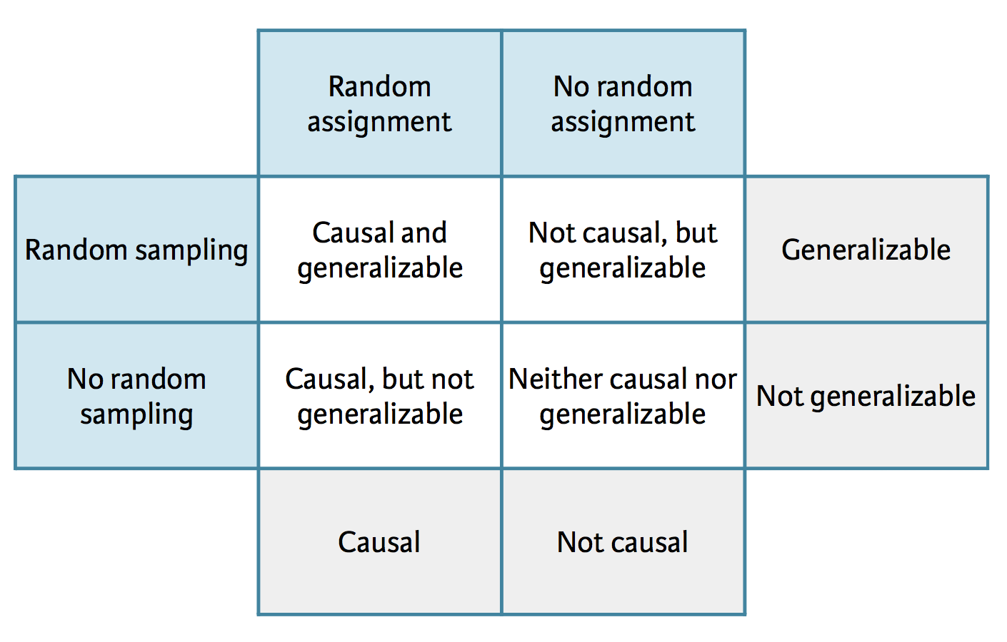
Image thanks to Data Science in a Box
Random Assignment means studies assign participants to treatment groups randomly
Random Sampling means that you randomly sample the population at large (very hard to do)
Generalizable means that your study should apply to the general population
Example - Climate Change
A July 2019 YouGov survey asked 1633 GB and 1333 USA randomly selected adults which of the following statements about the global environment best describes their view:
They had the choices:
- The climate is changing and human activity is mainly responsible
- The climate is changing and human activity is partly responsible, together with other factors
- The climate is changing but human activity is not responsible at all
- The climate is not changing
Source: YouGov - International Climate Change Survey
What kind of study is this?
What kind of results can we find?
Answer
This is a causal study. We can find associations.
Here is the data
Here we specify index_col=0 this makes it so instead of numbers on the far left we have the country abbreviations, which were in the first column of the .csv file.
file_name = 'data/yougov-climate.csv'
DF = pd.read_csv(file_name,index_col=0)
DF| The climate is changing and human activity is mainly responsible | The climate is changing and human activity is partly responsible, together with other factors | The climate is changing but human activity is not responsible at all | The climate is not changing | Don't know | |
|---|---|---|---|---|---|
| country | |||||
| GB | 833 | 604 | 49 | 33 | 114 |
| US | 507 | 493 | 120 | 80 | 133 |
First question:
What percent of all respondents think the climate is changing and human activity is mainly responsible?
Get totals across rows and columns:
The .sum() command can sum the rows (axis=0) or the columns (axis=1) of a data frame.
DF.loc['total']= DF.sum(axis=0)
DF['total'] = DF.sum(axis=1)
DF| The climate is changing and human activity is mainly responsible | The climate is changing and human activity is partly responsible, together with other factors | The climate is changing but human activity is not responsible at all | The climate is not changing | Don't know | total | |
|---|---|---|---|---|---|---|
| country | ||||||
| GB | 833 | 604 | 49 | 33 | 114 | 1633 |
| US | 507 | 493 | 120 | 80 | 133 | 1333 |
| total | 2680 | 2194 | 338 | 226 | 494 | 5932 |
Percent is just the part divided by the total. So we need to:
- Find the total number of survey respondents.
- Find the total number of survey respondents who thought human activity is responsible.
- Divide those two numbers to get a decimal
all_respondents = DF['total'].loc['total']
human_responsible = DF['The climate is changing and human activity is mainly responsible  ']['total']
human_responsible/all_respondents0.45178691840863117This means that overall 45.2% of people think that climate is changing and human activity is mainly responsible.
Second question:
What percent of GB respondents think the climate is changing and human activity is mainly responsible?
gb_respondants = DF['total'].loc['GB']
GB_human_responsible = DF['The climate is changing and human activity is mainly responsible  ']['GB']
GB_human_responsible/gb_respondants0.5101041028781383Of the people would responded from Great Britain, 51% think that climate is changing and human activity is mainly responsible.
Third Question
What percent of US respondents think the climate is changing and
human activity is mainly responsible?
us_respondants = DF['total'].loc['US']
US_human_responsible = DF['The climate is changing and human activity is mainly responsible  ']['US']
US_human_responsible/us_respondants0.3803450862715679When we consider US respondents we see that 38% (lower than GB) believe that climate is changing and human activity is mainly responsible.
What can we say?
Based on the percentages we calculated, does there appear to be a relationship between country and beliefs about climate change? If yes, could there be another variable that explains this relationship?
- There is a clear difference between Great Britain and the USA.
- So there is an association between country and your answer to this question.
- Could there be other confounding variables? YES!
We cannot say that being from GB causes you to be more likely to believe climate changes is caused by human activity. We can only say that there is a relationship between country and your belief.
————————
Conditional Probability
What do these percentages represent? We can say:
- If you are from the US there is a 38% probability that you believe climate change is caused by human activity.
- If you are from the GB there is a 51% probability that you believe climate change is caused by human activity.
This is called Conditional Probability $ P(A|B):$ Probability of event A given event B
Example: two different questions:
- What is the probability that it will be unseasonably warm tomorrow?
- What is the probability that it will be unseasonably warm tomorrow given that it was unseasonably warm today?
Independence
If knowing event A happened tells you something about event B happening - then these two things are linked - and we say A and B are not independent.
In our example: If you found that a person believed that climate change was not caused by human activity, it is more likely that they are from the US. Because these two things are not independent.
Otherwise events A and B are said to be independent and we know \(P(A|B) = P(A)\) - because knowing B doesn’t tell you anything about A.
Q Repeat the analysis for one of the other columns/questions.
- Percent total
- Percent from GB
- Percent from US
Talk about the conditional probability in this case:
eg. In a person is from ________ then there is a ________ probability that they believe _______. If a person answered _______ then they are more likley to be from ________.
————————
Simpson’s Paradox
Berkeley admission data example
- Study carried out by the Graduate Division of the University of California, Berkeley in the early 70’s to evaluate whether there was a gender bias in graduate admissions.
- The data come from six departments. For confidentiality we’ll call them A-F.
- We have information on whether the applicant was male or female and whether they were admitted or rejected. This is an old study so only two binary classifications were used.
Here is the data
file_name = 'data/berkley.csv'
DF = pd.read_csv(file_name)
show(DF)| Department | Male Yes | Male No | Female Yes | Female No |
|---|---|---|---|---|
|
Loading ITables v2.1.4 from the internet...
(need help?) |
DF_melt = pd.melt(DF,id_vars=['Department'],var_name='MF',value_name='Number')
DF_melt| Department | MF | Number | |
|---|---|---|---|
| 0 | A | Male Yes | 512 |
| 1 | B | Male Yes | 353 |
| 2 | C | Male Yes | 120 |
| 3 | D | Male Yes | 138 |
| 4 | E | Male Yes | 53 |
| 5 | F | Male Yes | 22 |
| 6 | A | Male No | 313 |
| 7 | B | Male No | 207 |
| 8 | C | Male No | 205 |
| 9 | D | Male No | 279 |
| 10 | E | Male No | 138 |
| 11 | F | Male No | 351 |
| 12 | A | Female Yes | 89 |
| 13 | B | Female Yes | 17 |
| 14 | C | Female Yes | 202 |
| 15 | D | Female Yes | 131 |
| 16 | E | Female Yes | 94 |
| 17 | F | Female Yes | 24 |
| 18 | A | Female No | 19 |
| 19 | B | Female No | 8 |
| 20 | C | Female No | 391 |
| 21 | D | Female No | 244 |
| 22 | E | Female No | 299 |
| 23 | F | Female No | 317 |
DF_melt['gender'] = DF_melt['MF'].apply(lambda x: x.split(' ')[0]).copy()
DF_melt['admitted'] = DF_melt['MF'].apply(lambda x: x.split(' ')[1]).copy()DF_melt| Department | MF | Number | gender | admitted | |
|---|---|---|---|---|---|
| 0 | A | Male Yes | 512 | Male | Yes |
| 1 | B | Male Yes | 353 | Male | Yes |
| 2 | C | Male Yes | 120 | Male | Yes |
| 3 | D | Male Yes | 138 | Male | Yes |
| 4 | E | Male Yes | 53 | Male | Yes |
| 5 | F | Male Yes | 22 | Male | Yes |
| 6 | A | Male No | 313 | Male | No |
| 7 | B | Male No | 207 | Male | No |
| 8 | C | Male No | 205 | Male | No |
| 9 | D | Male No | 279 | Male | No |
| 10 | E | Male No | 138 | Male | No |
| 11 | F | Male No | 351 | Male | No |
| 12 | A | Female Yes | 89 | Female | Yes |
| 13 | B | Female Yes | 17 | Female | Yes |
| 14 | C | Female Yes | 202 | Female | Yes |
| 15 | D | Female Yes | 131 | Female | Yes |
| 16 | E | Female Yes | 94 | Female | Yes |
| 17 | F | Female Yes | 24 | Female | Yes |
| 18 | A | Female No | 19 | Female | No |
| 19 | B | Female No | 8 | Female | No |
| 20 | C | Female No | 391 | Female | No |
| 21 | D | Female No | 244 | Female | No |
| 22 | E | Female No | 299 | Female | No |
| 23 | F | Female No | 317 | Female | No |
Percent males vs females
First, we will evaluate whether the percentage of males admitted is indeed higher than females, overall.
\[ P(Admit | Male) \]
\[ P(Admit | Female) \]
my_columns = ['Number','gender','admitted']
DF_totals = DF_melt[my_columns].groupby(['gender','admitted'],as_index=False).sum()
DF_totals| gender | admitted | Number | |
|---|---|---|---|
| 0 | Female | No | 1278 |
| 1 | Female | Yes | 557 |
| 2 | Male | No | 1493 |
| 3 | Male | Yes | 1198 |
# Get the total numbers in each group
mask = DF_totals['gender'] == 'Male'
num_male = DF_totals[mask]['Number'].sum()
mask = DF_totals['gender'] == 'Female'
num_female = DF_totals[mask]['Number'].sum()

# # Find the percents
mask = (DF_totals['gender'] == 'Male') & (DF_totals['admitted'] == 'Yes')
prob_male = DF_totals[mask]['Number']/num_male
mask = (DF_totals['gender'] == 'Female') & (DF_totals['admitted'] == 'Yes')
prob_female = DF_totals[mask]['Number']/num_femaleprob_male3 0.445188
Name: Number, dtype: float64prob_female1 0.303542
Name: Number, dtype: float64So mathematically we can say:
\[ P(Admit | Male) = 0.445\]
\[ P(Admit | Female) = 0.304\]
So the answer is YES the admission rate is higer for males.
fig = px.histogram(DF_totals,
                     x='Number',
                     y='gender',
                     color='admitted',
                     barnorm = "percent",
                     color_discrete_map = {'No':'#99d8c9','Yes':'#2ca25f'})

fig.update_layout(title='Percent male and female applications',
                  title_x=0.5,
                  template="plotly_white",
                  xaxis_title="",
                  yaxis_title="Gender",
                  legend_title='Admitted',
                  autosize=False,
                  width=800,
                  height=500)

fig.show()
What do we see here?
Well it does in fact look like women were admitted at a lower rate than men.
Another way to do this - multi index data frame
If you us .groupby() with more than one column and don’t specify as_index=False then you get a multi index data frame. This can be really convenient. Below is our calculation using the multi index data frame.
WARNING Plotly express will give errors if you try to send it a multi index data frame.
my_columns = ['Number','gender','admitted']
DF_totals = DF_melt[my_columns].groupby(['gender','admitted']).sum()
DF_totals| Number | ||
|---|---|---|
| gender | admitted | |
| Female | No | 1278 |
| Yes | 557 | |
| Male | No | 1493 |
| Yes | 1198 |
# Get the total numbers in each group
num_male = DF_totals.loc['Male'].sum()
num_female = DF_totals.loc['Female'].sum()

# # Find the percents
prob_male = DF_totals.loc['Male','Yes']/num_male
prob_female = DF_totals.loc['Female', 'Yes']/num_female

print(prob_male)
print(prob_female)
Number 0.445188
dtype: float64
Number 0.303542
dtype: float64Gender distribution by department
What can we say about the gender distribution if we look at the individual departments.
Start with our original “melted” data frame:
DF_melt| Department | MF | Number | gender | admitted | |
|---|---|---|---|---|---|
| 0 | A | Male Yes | 512 | Male | Yes |
| 1 | B | Male Yes | 353 | Male | Yes |
| 2 | C | Male Yes | 120 | Male | Yes |
| 3 | D | Male Yes | 138 | Male | Yes |
| 4 | E | Male Yes | 53 | Male | Yes |
| 5 | F | Male Yes | 22 | Male | Yes |
| 6 | A | Male No | 313 | Male | No |
| 7 | B | Male No | 207 | Male | No |
| 8 | C | Male No | 205 | Male | No |
| 9 | D | Male No | 279 | Male | No |
| 10 | E | Male No | 138 | Male | No |
| 11 | F | Male No | 351 | Male | No |
| 12 | A | Female Yes | 89 | Female | Yes |
| 13 | B | Female Yes | 17 | Female | Yes |
| 14 | C | Female Yes | 202 | Female | Yes |
| 15 | D | Female Yes | 131 | Female | Yes |
| 16 | E | Female Yes | 94 | Female | Yes |
| 17 | F | Female Yes | 24 | Female | Yes |
| 18 | A | Female No | 19 | Female | No |
| 19 | B | Female No | 8 | Female | No |
| 20 | C | Female No | 391 | Female | No |
| 21 | D | Female No | 244 | Female | No |
| 22 | E | Female No | 299 | Female | No |
| 23 | F | Female No | 317 | Female | No |
Lets pivot!
Pivot this data so that our departments become the column labels and our MF column becomes the index.
DF_dept = DF_melt.pivot(index='MF',columns='Department',values='Number')
DF_dept| Department | A | B | C | D | E | F |
|---|---|---|---|---|---|---|
| MF | ||||||
| Female No | 19 | 8 | 391 | 244 | 299 | 317 |
| Female Yes | 89 | 17 | 202 | 131 | 94 | 24 |
| Male No | 313 | 207 | 205 | 279 | 138 | 351 |
| Male Yes | 512 | 353 | 120 | 138 | 53 | 22 |
Percentages for department A
Here we can calculate the probability that a student is admitted and female or male for department A
Remember percent is just the part divide by the total.
NOTICE I am doing something new here!
DF_dept['A']['Female Yes']This selects column ‘A’ and row named ‘Female Yes’. Another way to do this exact same thing is:
DF_dept['A'].loc['Female Yes']prob_female = DF_dept['A']['Female Yes']/(DF_dept['A']['Female Yes']+DF_dept['A']['Female No'])
prob_male = DF_dept['A']['Male Yes']/(DF_dept['A']['Male Yes']+DF_dept['A']['Male No'])prob_female0.8240740740740741prob_male0.6206060606060606So actually the probability of being admitted was BETTER for females.
Q Calculate the proportions for the other departments.
You can do this one by one or try using a FOR loop.
Here is a plot of the proportions data
fig = px.histogram(DF_melt,
                   y='gender',
                   x='Number',
                   barnorm = "percent",
                   color='admitted',
                   facet_col='Department',
                   facet_col_wrap=2,
                   color_discrete_map = {'No':'#99d8c9','Yes':'#2ca25f'})

fig.for_each_annotation(lambda a: a.update(text=a.text.split("=")[1]))
fig.update_xaxes(title_text='')

fig.update_layout(title='Percent male and female applications',
                  title_x=0.5,
                  template="plotly_white",
                  xaxis_title="",
                  yaxis_title="Gender",
                  legend_title='Admitted',
                  autosize=False,
                  width=800,
                  height=500)

fig.show()
What do we see here?
Well actually in department A women were more likely to be admitted by quite a bit, and in the other departments they were either just barely less than men or more than men. This seems to contradict what we saw in our plot above!
Which picture is the real story?!?
Take a closer look at the departments
How many women were applying in the first place?
DF| Department | Male Yes | Male No | Female Yes | Female No | |
|---|---|---|---|---|---|
| 0 | A | 512 | 313 | 89 | 19 |
| 1 | B | 353 | 207 | 17 | 8 |
| 2 | C | 120 | 205 | 202 | 391 |
| 3 | D | 138 | 279 | 131 | 244 |
| 4 | E | 53 | 138 | 94 | 299 |
| 5 | F | 22 | 351 | 24 | 317 |
Add the totals column to the data
DF['totals'] = DF[['Male Yes', 'Male No', 'Female Yes', 'Female No']].sum(axis=1)DF| Department | Male Yes | Male No | Female Yes | Female No | totals | |
|---|---|---|---|---|---|---|
| 0 | A | 512 | 313 | 89 | 19 | 933 |
| 1 | B | 353 | 207 | 17 | 8 | 585 |
| 2 | C | 120 | 205 | 202 | 391 | 918 |
| 3 | D | 138 | 279 | 131 | 244 | 792 |
| 4 | E | 53 | 138 | 94 | 299 | 584 |
| 5 | F | 22 | 351 | 24 | 317 | 714 |
DF.columnsIndex(['Department', 'Male Yes', 'Male No', 'Female Yes', 'Female No',
'totals'],
dtype='object')Make separate Data Frames for Male and Female
DF_male = DF[['Department', 'Male Yes', 'Male No']].copy()
DF_female = DF[['Department', 'Female Yes', 'Female No']].copy()
Add columns to the data frames
Yes is the percent accepted
No is the percent not accepted
proportion is the proportion of applications from that department that came from that gender
DF_male['Yes'] = DF_male['Male Yes']/(DF_male['Male Yes']+DF_male['Male No'])
DF_male['No'] = DF_male['Male No']/(DF_male['Male Yes']+DF_male['Male No'])
DF_male['proportion'] = (DF_male['Male Yes']+DF_male['Male No'])/DF['totals']DF_male| Department | Male Yes | Male No | Yes | No | proportion | |
|---|---|---|---|---|---|---|
| 0 | A | 512 | 313 | 0.620606 | 0.379394 | 0.884244 |
| 1 | B | 353 | 207 | 0.630357 | 0.369643 | 0.957265 |
| 2 | C | 120 | 205 | 0.369231 | 0.630769 | 0.354031 |
| 3 | D | 138 | 279 | 0.330935 | 0.669065 | 0.526515 |
| 4 | E | 53 | 138 | 0.277487 | 0.722513 | 0.327055 |
| 5 | F | 22 | 351 | 0.058981 | 0.941019 | 0.522409 |
DF_female['Yes'] = DF_female['Female Yes']/(DF_female['Female Yes']+DF_female['Female No'])
DF_female['No'] = DF_female['Female No']/(DF_female['Female Yes']+DF_female['Female No'])
DF_female['proportion'] = (DF_female['Female Yes']+DF_female['Female No'])/DF['totals']DF_female| Department | Female Yes | Female No | Yes | No | proportion | |
|---|---|---|---|---|---|---|
| 0 | A | 89 | 19 | 0.824074 | 0.175926 | 0.115756 |
| 1 | B | 17 | 8 | 0.680000 | 0.320000 | 0.042735 |
| 2 | C | 202 | 391 | 0.340641 | 0.659359 | 0.645969 |
| 3 | D | 131 | 244 | 0.349333 | 0.650667 | 0.473485 |
| 4 | E | 94 | 299 | 0.239186 | 0.760814 | 0.672945 |
| 5 | F | 24 | 317 | 0.070381 | 0.929619 | 0.477591 |
These calculations give us a better picture! We see that the number of applications are not even.
Consider department A:
- 88.4% applications come from males and only 11.6% from females - this department admitted 512 males and 89 females. So even thought the acceptance rate for females was 82.4% this department still has a small overall number of females.
Consider department F:
- This smaller department admitted about the same numbers of males and females and they got about the same number of applications from each gender.
This is Simpson’s Paradox
- When we see a trend when we look at the data grouping one way, but the trend disappears or reverses when we look at the data another way.
- Not considering an important variable when studying a relationship can result in Simpson’s paradox
- Simpson’s paradox illustrates the effect that omission of an explanatory variable can have on the measure of association between another explanatory variable and a response variable
- The inclusion of a third variable in the analysis can change the apparent relationship between the other two variables
————————
Example of Simposons Paradox
Consider some data, put it in a scatter plot and draw a line of best fit.
df = pd.DataFrame()
df['x'] = [2,3,4,5,6,7,8,9]
df['y'] = [4,3,2,1,11,10,9,8]
df['z'] = ['A','A','A','A','B','B','B','B']
df| x | y | z | |
|---|---|---|---|
| 0 | 2 | 4 | A |
| 1 | 3 | 3 | A |
| 2 | 4 | 2 | A |
| 3 | 5 | 1 | A |
| 4 | 6 | 11 | B |
| 5 | 7 | 10 | B |
| 6 | 8 | 9 | B |
| 7 | 9 | 8 | B |
fig = px.scatter(df,x='x',y='y',trendline="ols")

fig.show()
But we ignored one of the variables z. If we include z we get a completely different picture. On average the data looked very different than when considering the subgroups.
fig = px.scatter(df,x='x',y='y',color='z',trendline="ols")

fig.show()
————————
Homework - Exercises
** Homework content and data from Data Science in a Box - he-05-legos.Rmd
This week we’ll do some data gymnastics to refresh and review what we learned over the past few weeks using (simulated) data from Lego sales in 2018 for a sample of customers who bought Legos in the US. This is different than the data we used on the Exam!
Data
file_name = 'data/lego-sales.csv'
DF = pd.read_csv(file_name)
DF| first_name | last_name | age | phone_number | set_id | number | theme | subtheme | year | name | pieces | us_price | image_url | quantity | |
|---|---|---|---|---|---|---|---|---|---|---|---|---|---|---|
| 0 | Kimberly | Beckstead | 24 | 216-555-2549 | 24701 | 76062 | DC Comics Super Heroes | Mighty Micros | 2018 | Robin vs. Bane | 77.0 | 9.99 | http://images.brickset.com/sets/images/76062-1... | 1 |
| 1 | Neel | Garvin | 35 | 819-555-3189 | 25626 | 70595 | Ninjago | Rise of the Villains | 2018 | Ultra Stealth Raider | 1093.0 | 119.99 | http://images.brickset.com/sets/images/70595-1... | 1 |
| 2 | Neel | Garvin | 35 | 819-555-3189 | 24665 | 21031 | Architecture | NaN | 2018 | Burj Khalifa | 333.0 | 39.99 | http://images.brickset.com/sets/images/21031-1... | 1 |
| 3 | Chelsea | Bouchard | 41 | NaN | 24695 | 31048 | Creator | NaN | 2018 | Lakeside Lodge | 368.0 | 29.99 | http://images.brickset.com/sets/images/31048-1... | 1 |
| 4 | Chelsea | Bouchard | 41 | NaN | 25626 | 70595 | Ninjago | Rise of the Villains | 2018 | Ultra Stealth Raider | 1093.0 | 119.99 | http://images.brickset.com/sets/images/70595-1... | 1 |
| ... | ... | ... | ... | ... | ... | ... | ... | ... | ... | ... | ... | ... | ... | ... |
| 615 | Talise | Nieukirk | 16 | 801-555-2343 | 24902 | 41556 | Mixels | Series 7 | 2018 | Tiketz | 62.0 | 4.99 | http://images.brickset.com/sets/images/41556-1... | 2 |
| 616 | Spencer | Morgan | 28 | 784-555-3455 | 26041 | 41580 | Mixels | Series 9 | 2018 | Myke | 63.0 | 4.99 | NaN | 2 |
| 617 | Spencer | Morgan | 28 | 784-555-3455 | 26060 | 5005051 | Gear | Digital Media | 2018 | Friends of Heartlake City Girlz 4 Life | NaN | 19.99 | NaN | 1 |
| 618 | Amelia | Hageman | 40 | 336-555-1950 | 24702 | 76063 | DC Comics Super Heroes | Mighty Micros | 2018 | The Flash vs. Captain Cold | 88.0 | 9.99 | http://images.brickset.com/sets/images/76063-1... | 2 |
| 619 | Amelia | Hageman | 40 | 336-555-1950 | 24720 | 10830 | Duplo | NaN | 2018 | Minnie's Café | 27.0 | 19.99 | http://images.brickset.com/sets/images/10830-1... | 4 |
620 rows × 14 columns
Exercises
- Answer the following questions using reproducible Python code.
- For each question, state your answer in a sentence, e.g. “In this sample, the first three common names of purchasers are …”.
- Note that the answers to all questions are within the context of this particular sample of sales, i.e. you shouldn’t make inferences about the population of all Lego sales based on this sample.
Describe what you see in the data set (variables, observations, etc)
What are the three most common first names of purchasers?
What are the three most common themes of Lego sets purchased?
Among the most common theme of Lego sets purchased, what is the most common subtheme?
Create data frames for each of the ages in the following categories: “18 and under”, “19 - 25”, “26 - 35”, “36 - 50”, “51 and over”. HINT - use masks and create separate data frames -OR- create a new column with these categorical labels (more advanced).
Which age group has purchased the highest number of Lego sets.
Which age group has spent the most money on Legos?
Which Lego theme has made the most money for Lego? HINT: Simpler than #5, just use a groupby()
Which area code has spent the most money on Legos? In the US the area code is the first 3 digits of a phone number. HINT: You will need to split the phone number and get just the first three. You decided what to do about reporting the NaNs.
Come up with a question you want to answer using these data, and write it down. Then, create a data visualization that answers the question, and explain how your visualization answers the question.