# We will just go ahead and import all the useful packages first.
import numpy as np
import sympy as sp
import pandas as pd
import matplotlib.pyplot as plt
from mpl_toolkits.mplot3d import Axes3D

# Special Functions
from sklearn.metrics import r2_score, mean_squared_error

## NEW
from scipy.stats import binom, beta, norm

# Functions to deal with dates
import datetimeMath for Data Science
Normal Distribution Testing
Important Information
- Email: joanna_bieri@redlands.edu
- Office Hours take place in Duke 209 unless otherwise noted – Office Hours Schedule
Today’s Goals:
- Normal Distribution
- Hypothesis Testing
- F-test and t-test on Polynomial Regressions
Probabilities so Far
We have discussed how to use data to compute probabilities and how to combine probabilities to ask more interesting questions (Joint, Union, Conditional). We have also explored the idea of probability distributions and looked at a few examples where they might arise in our data.
Today we will talk about a distribution that many of you have heard of The Normal Distribution and discuss the idea of Hypothesis Testing in general terms.
Finally, we will return to our old friend polynomial regression, and explore a few more tests that can give us information about the probability that we have a good fit for our given data.
The Normal Distribution
First, I am assuming that you are somewhat familiar with the ideas of the mean and standard deviation of data. In python we can use:
np.mean()
np.std()
To calculate the mean and standard deviation of our data.
The Normal Distribution also called the Gaussian Distribution is a symmetry bell shaped curve that has most of it’s mass around the mean.
Here is a plot of the Standard Normal Distribtion, where the mean is \(\mu=0\) and the standard deviation \(\sigma=1\).
mu = 0  # Mean
sigma = 1  # Standard deviation


x = np.linspace(mu - 4 * sigma, mu + 4 * sigma, 1000)
# Calculate the probability density function (PDF)
pdf = norm.pdf(x, mu, sigma)

# Create the plot
plt.figure(figsize=(8, 6))
plt.plot(x, pdf, 'r-', lw=2)
plt.title('Normal Distribution (Gaussian)')
plt.xlabel('x')
plt.ylabel('Probability Density')
plt.grid(True) # adds grid lines
plt.show()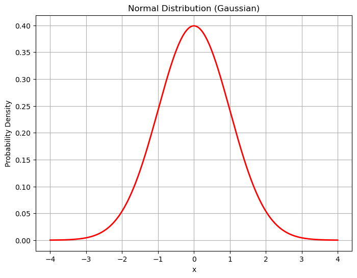
The normal distribution arises often in nature. Think about things like the height or weight of animals. Some might be really large or really small, but most are somewhere in the middle.
Properties of a Normal Distribution
- It is symmetrical, mirrored across the mean value (the center)
- Most of the mass is at the center
- It has spread (width) based on the standard deviation
- The “tails” on either side of the mean approach zero as \(x\to\pm\infty\)
The probability density function for the normal distribution is given by
\[f(x) = \frac{1}{\sigma\sqrt{2\pi}}e^{-\frac{1}{2}\left(\frac{x-\mu}{\sigma}\right)^2}\]
We can actually plot this function and see that it is the same as what we get from norm.pdf() above.
def normal_pdf(x,mu,sigma):
    return 1/(sigma*np.sqrt(2*np.pi))*np.exp(-(1/2)*( (x-mu)/sigma)**2)

mu = 0  # Mean
sigma = 1  # Standard deviation
x = np.arange(-4,4,.01)
my_pdf = normal_pdf(x,mu,sigma)

plt.plot(x,my_pdf)
plt.grid()
plt.show()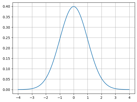
Example
*From our book**
Let’s say we sample the weight of 50 adult golden retrievers and plot them on a number line.
# Here is some code that will generate data for us.
data = pd.read_csv('https://joannabieri.com/mathdatascience/data/goldenweights.csv')
golden_retriever_weights = list(data['weight'])

# Make a line plot
y = np.zeros(len(golden_retriever_weights))
plt.figure(figsize=(10, 2))  # Adjust figure size as needed
plt.scatter(golden_retriever_weights, y, s=100, marker='o', color='black',alpha=.5) #plot points
plt.yticks([])  # Hide y-axis ticks
plt.xlabel("Golden Retriever Weights")
plt.axhline(0, color='black', linewidth=0.8) #draw the numberline
plt.grid(True, axis='x', linestyle='--', alpha=0.6) #add grid for x-axis
plt.show()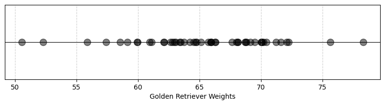
Here we see that there are more values toward the center, around 50-70 pounds than at the edges. We could also plot this data on a histogram!
Histogram
Remember that a histogram is a bar graph that helps you visualize the patterns and trends within a set of data by grouping values into ranges and showing how often those ranges occur.
- The width of the bars is set by the number of bins
- The height of the bars is set by the frequency of observations
It is up to you to choose the number of bins! Below you will see code for 30 bins and for 7 bins. Which one helps us to see the bell curve that we expect from normally distributed data?
plt.hist(golden_retriever_weights, bins=30, edgecolor='black')
plt.title("Distribution of Golden Retriever Weights")
plt.xlabel("Weight (pounds)")
plt.ylabel("Frequency")
plt.grid(True)
plt.show()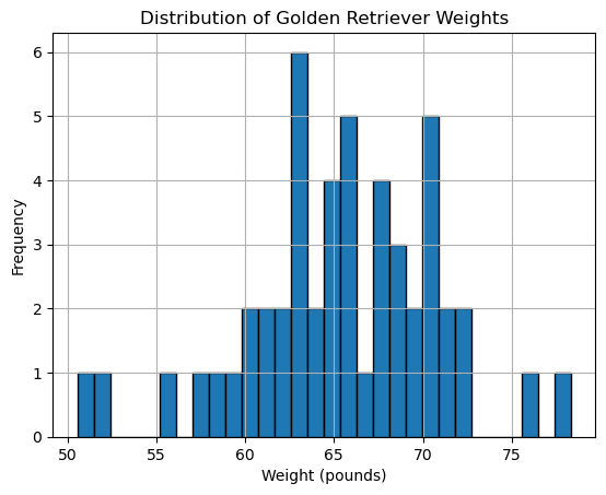
plt.hist(golden_retriever_weights, bins=7, edgecolor='black')
plt.title("Distribution of Golden Retriever Weights")
plt.xlabel("Weight (pounds)")
plt.ylabel("Frequency")
plt.grid(True)
plt.show()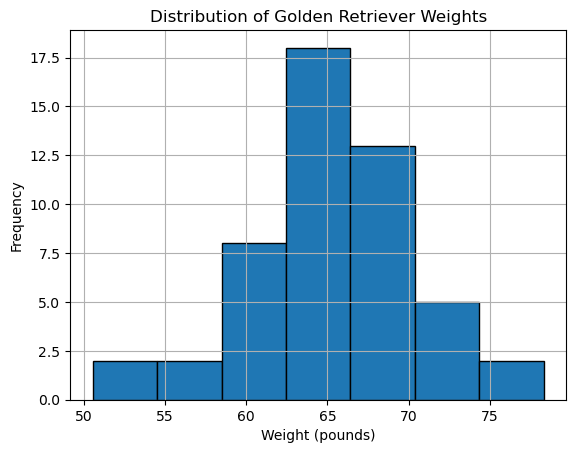
As we decrease our bins we start to see that our data does begin to fill in a bell curve (not perfect!) I don’t expect it to be perfect because the data is just a sample of the full population.
Let’s calculate the mean and the standard deviation of our data and compare to a normal distribution of this data.
mu = np.mean(golden_retriever_weights)
sigma = np.std(golden_retriever_weights)

print(f'The average is: {mu}')
print(f'The standard deviation is: {sigma}')

x = np.linspace(np.min(golden_retriever_weights)-4, np.max(golden_retriever_weights) + 4, 1000)
# Calculate the probability density function (PDF)
pdf = norm.pdf(x, mu, sigma)

# Create the plot
plt.figure(figsize=(8, 6))
plt.plot(x, pdf, 'r-', lw=2)
plt.plot(golden_retriever_weights, y,'ok',alpha=.5)
plt.title('Normal Distribution (Gaussian)')
plt.xlabel('x')
plt.ylabel('Probability Density for Golden Retriever Weights')
plt.grid(True) # adds grid lines
plt.show()
The average is: 65.405043722571
The standard deviation is: 5.3610122946938406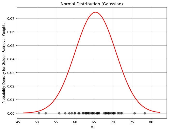
Cumulative Distribution Function
Now we are in the position to ask some questions!
- What is the probability that a random golden retriever will have a weight between 60 and 70 pounds?
Remember The normal distribution is a continuous distribution so we need to use the area under the curve to understand probabilities! We can use the Cumulative Distribution Function (CDF) to answer the question.
- Find the probability that the weight is between 0 and 70
- Find the probability that the weight is between 0 and 60
- Subtract the second calculation from the first calculation to get the probability that the weights are between these two numbers
x_upper = 70
x_lower = 60

p_upper = norm.cdf(x_upper,mu,sigma)
p_lower = norm.cdf(x_lower,mu,sigma)

p_between = p_upper - p_lower
print(f'The probability that the weight is between {x_lower} and {x_upper} is {p_between}')
The probability that the weight is between 60 and 70 is 0.6476308266802573You Try
- What is the probability that the weight is between 50 and 60?
- What is the probability that the weight is less than or equal to 50?
- How do these numbers compare to the probability of being between 60 and 70?
- Does this make sense? Why or why not?
Inverse CDF
In the example above we calculated the probability that we observe weights within a range from a random sample of the population. AKA: what is the probability the weight is between A and B? Sometimes we want to ask a different question. What is the weight that a certain percentage of the population will fall under?
Let’s start by plotting the CDF - this is a plot of the area under the probability distribution function as we increase the x-value or the weight.
x = np.linspace(np.min(golden_retriever_weights)-4, np.max(golden_retriever_weights) + 4, 1000)
# Calculate the probability density function (PDF)
pdf = norm.pdf(x, mu, sigma)
cdf = norm.cdf(x, mu, sigma)

# Create the plot
plt.figure(figsize=(8, 6))
plt.plot(x, pdf, 'r-', lw=2)
plt.plot(x, cdf, 'b-', lw=2)
plt.title('Normal Distribution (Gaussian) and Cumulative Distribution')
plt.xlabel('x')
plt.grid(True) # adds grid lines
plt.show()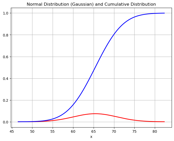
Some things to notice:
- as \(x\) increases the CDF increases - there is more area under the curve as we increase the x-value.
- when \(x=1\) the CDF = 1 - the total area under the curve is 1.
How can we use this picture? Given an x-value (a weight) we can see what the area under the curve is by looking it up on the blue line. For example, if we want the probability that a golden retrievers weight is below 65 points, we can see that this corresponds to a value of about 0.45.
But now what if I wanted to turn this question around? For example, what weight should I expect 90% of my population to be below? This is going backward - we loo up the percentage on the y-axis and return the weight from the x-axis. This is an inverse!
The inverse cumulative distribution function also called the percent point function can be both plotted and calculated using python
# Find the inverse to answer our question
norm.ppf(.9,mu,sigma)72.27545742173973We expect 90% of our population to have a weight below 72.28 pounds.
x = np.linspace(0,1, 1000)
# Calculate the probability density function (PDF)
ppf = norm.ppf(x, mu, sigma)

# Create the plot
plt.figure(figsize=(8, 6))
plt.plot(x, ppf, 'g-', lw=2)
plt.title('Inverse Cumulative Density for Golden Retriever Weights')
plt.xlabel('Probability')
plt.ylabel('Weight')
plt.grid(True) # adds grid lines
plt.show()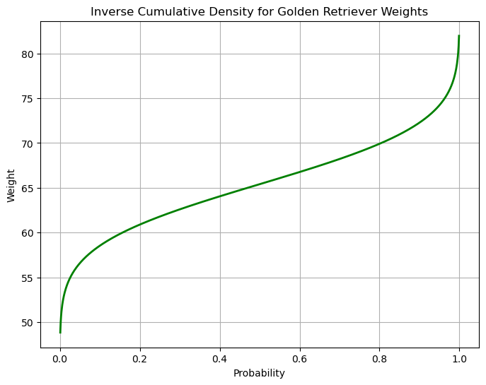
You Try
- What weight should I expect 20% of my population to be below?
- What weight should I expect half of my population to be below and half to be above?
- What weight should I expect 60% of my population to be above?
Is my data normal?
When dealing with a normal distribution, the “68-95-99.7 rule,” also known as the empirical rule, provides a useful guideline for understanding the percentage of data that falls within certain standard deviations of the mean. Here’s a breakdown:
- Within 1 standard deviation: Approximately 68% of the data falls within one standard deviation of the mean.
- Within 2 standard deviations: Approximately 95% of the data falls within two standard deviations of the mean. - Within 3 standard deviations: Approximately 99.7% of the data falls within three standard deviations of the mean.
One way to test for outliers is to look for how many scores are outside of the 3-standard deviation range.
Exploring Normal Distributions - You Try
Below is code that generates sample data for two groups of students: Cheaters and Non-Cheaters. You can run the cell below without making changes the first time to see what happens if there are no cheaters:
num_students = 100
num_cheaters = 0
PART 1:
- Plot a Histogram of the data when there are no cheaters and talk about the mean and standard deviation of the data.
- What is the probability the a students score is 75% or below?
- What is the probability that a students score is above 90%?
- What score should 75% of the class score below?
- What score should 90% of the class score below?
- What is the score for the top 10% of students?
PART 2:
Now redo the experiment but now add some cheaters:
num_students = 90
num_cheaters = 10
What do you notice about your distribution. Say in words what happens to the mean and standard deviation. Talk about what happens to your histogram. How do your probabilities and percent populations change?
# Just run this code
# Set a random seed for reproducibility
np.random.seed(42)

# Simulate non Cheaters
num_students = 100
mean_score = 75
std_dev_score = 10
scores = np.random.normal(mean_score, std_dev_score, num_students)

# Simulate "cheaters"
# higher mean, lower std. dev.
num_cheaters = 0
mean_score = 95
std_dev_score = 5
cheater_scores = np.random.normal(mean_score, std_dev_score, num_cheaters)

# Combine the two into one data set
scores = np.concatenate((scores, cheater_scores)) #combine the two groups

y = np.zeros(len(scores))
plt.figure(figsize=(10, 2))  # Adjust figure size as needed
plt.scatter(scores, y, s=100, marker='o', color='black',alpha=.5) #plot points
plt.yticks([])  # Hide y-axis ticks
plt.xlabel("Exam Scores")
plt.axhline(0, color='black', linewidth=0.8) #draw the numberline
plt.grid(True, axis='x', linestyle='--', alpha=0.6) #add grid for x-axis
plt.show()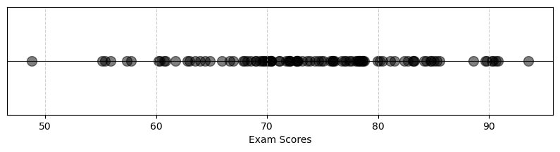
Code
# Plot a histogram of the data
plt.hist(scores, bins=9, edgecolor='black')
plt.title("Simulated Test Scores (with Cheaters)")
plt.xlabel("Score")
plt.ylabel("Frequency")
plt.show()

data_mean = np.mean(scores)
data_std = np.std(scores)
print(f"Mean of all scores: {np.mean(scores)}")
print(f"Standard deviation of all scores: {np.std(scores)}")

print(f'Probability below 75: {norm.cdf(75,data_mean,data_std)}')
print(f'Probability above 90: {1-norm.cdf(90,data_mean,data_std)}')
print(f'75 percent of the class should get a grade below: {norm.ppf(.75,data_mean,data_std)}')
print(f'90 percent of the class should get a grade below: {norm.ppf(.9,data_mean,data_std)}')
print(f'The top 10 percent earned {norm.ppf(.9,data_mean,data_std)} or above.')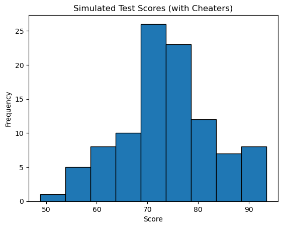
Mean of all scores: 73.96153482605907
Standard deviation of all scores: 9.036161766446297
Probability below 75: 0.5457470260424949
Probability above 90: 0.03795554021232128
75 percent of the class should get a grade below: 80.05633331864081
90 percent of the class should get a grade below: 85.54184208436257
The top 10 percent earned 85.54184208436257 or above.
Check if the data is ‘Normal’
Here is code to help us check if our data really is following a normal distribution:
- Run the 68-95-99.7 rule code below for the case of cheaters and no cheaters.
- Can you figure out what the code is doing?
- You should start to see some skew in the data - the data is not fitting the normal distribution quite as well.
# Check if our data is normally distributed
num_std = [1,2,3]

for n in num_std:
    # Get the mean and std
    mu = np.mean(scores)
    sigma = np.std(scores)
    # Get the range +- n standard deviations
    upper = mu+n*sigma
    lower = mu-n*sigma
    # Count up the data
    count = 0
    for d in scores:
        if d < upper and d>lower:
            count+=1
    print(f'Within {n} standard deviations we have {count/len(scores)*100} percent of the data')
Within 1 standard deviations we have 65.0 percent of the data
Within 2 standard deviations we have 95.0 percent of the data
Within 3 standard deviations we have 100.0 percent of the dataUniformly Distributed data
We are going to do an interesting experiment. Below you will find code that simulates the rolling of dice. You can roll as many dice as you want, from 1 up. The code then counts up the total score you got while rolling. We will start by just rolling 1 die:
num_rolls = 1000
num_dice = 1
Before you run the code What do you expect to see…. How many 1’s, 2’s, 3’s etc?
num_rolls = 1000
num_dice = 1 # Number of dice rolled each time

sums = []
for _ in range(num_rolls):
    roll_results = np.random.randint(1, 8, num_dice) # Simulates dice rolls
    sums.append(np.sum(roll_results))

print(f'The mean is: {np.mean(sums)}')
print(f'The standard deviation is: {np.std(sums)}')

plt.hist(sums, bins=7, edgecolor='black')
plt.title("Simulated Sum of Dice Rolls")
plt.xlabel("Sum of Dice")
plt.ylabel("Frequency")
plt.show()
The mean is: 3.938
The standard deviation is: 2.00353587439806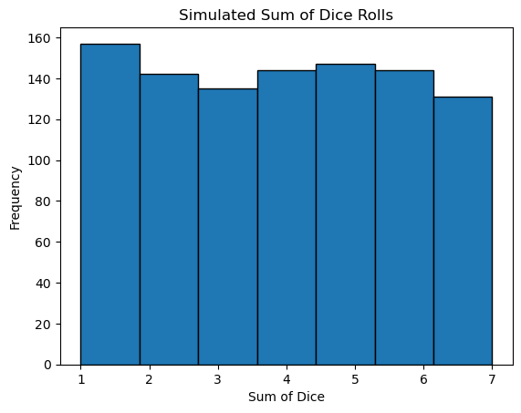
You Try
Now we will explore what happens as we increase the number of dice. In the example with one die you should have seen a Uniform Distribution - each outcome was equally likely. What do you notice here as you increase the number of samples you are summing?
- Go from 2-31 dice
- Is the distribution still uniform?
- Can you use the 68-95-99.7 rule to test what type of distribution you have? Can you come up with how to answer this question (write code)?
num_rolls = 1000
num_dice = 1 # Number of dice rolled each time

sums = []
for _ in range(num_rolls):
    roll_results = np.random.randint(1, 8, num_dice) # Simulates dice rolls
    sums.append(np.sum(roll_results))

print(f'The mean is: {np.mean(sums)}')
print(f'The standard deviation is: {np.std(sums)}')

plt.hist(sums, bins=7, edgecolor='black')
plt.title("Simulated Sum of Dice Rolls")
plt.xlabel("Sum of Dice")
plt.ylabel("Frequency")
plt.show()
The mean is: 3.973
The standard deviation is: 2.0050613456949393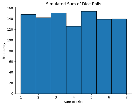
Code
num_std = [1,2,3]

for n in num_std:
    mu = np.mean(sums)
    sigma = np.std(sums)
    upper = mu+n*sigma
    lower = mu-n*sigma
    count = 0
    for d in sums:
        if d < upper and d>lower:
            count+=1
    print(f'Within {n} standard deviations we have {count/len(sums)*100} percent of the data')
Within 1 standard deviations we have 57.3 percent of the data
Within 2 standard deviations we have 100.0 percent of the data
Within 3 standard deviations we have 100.0 percent of the data