# We will just go ahead and import all the useful packages first.
import numpy as np
import sympy as sp
import pandas as pd
import matplotlib.pyplot as plt
from mpl_toolkits.mplot3d import Axes3D

# Special Functions
from sklearn.metrics import r2_score, mean_squared_error
from sklearn.neighbors import KNeighborsClassifier
from scipy.stats import binom, beta, norm

# Functions to deal with dates
import datetimeMath for Data Science
Dimensionality Reduction
Important Information
- Email: joanna_bieri@redlands.edu
- Office Hours take place in Duke 209 unless otherwise noted – Office Hours Schedule
Today’s Goals:
- Applications of Linear Algebra
- Dimensionality Reduction
# Code to help with plotting
# Just run this cell!

def plot_eigenvectors(Q,lam):
    """
    Plots two basis vectors
    """
    v1 = lam[0]*Q[:,0]
    v2 = lam[1]*Q[:,1]
    if len(v1) != 2 or len(v2) != 2:
        raise ValueError("Basis vectors must be 2-dimensional.")

    fig, ax = plt.subplots()

    # Set up the plot limits and aspect ratio
    max_val = max(abs(v1[0]), abs(v1[1]), abs(v2[0]), abs(v2[1]))
    ax.set_xlim(-max_val - 1, max_val + 1)
    ax.set_ylim(-max_val - 1, max_val + 1)
    # Make the grid look nice
    ax.set_aspect('equal', adjustable='box')
    ax.grid(True, linestyle='--', alpha=0.7)
    # Add the x and y axis
    ax.axhline(0, color='black', linewidth=0.5)
    ax.axvline(0, color='black', linewidth=0.5)
    # Labels
    ax.set_xlabel('x-axis')
    ax.set_ylabel('y-axis')
    # Title
    ax.set_title('Basis Vectors and Swept Area')

    # Plot the basis vectors
    ax.arrow(0, 0, v1[0], v1[1], head_width=0.2, head_length=0.3, fc='blue', ec='blue', label='Eigenvector 1')
    ax.arrow(0, 0, v2[0], v2[1], head_width=0.2, head_length=0.3, fc='green', ec='green', label='Eigenvector 2')

    ax.legend()
    plt.show()
Vectors and Matrices (review)
Span of a set of vectors is the whole set of possible vectors that can be created by taking a linear combination of the vectors in the set.
Two vectors are Linearly Independent if they do not lie along the same line.
We can tell if two vectors are Linearly Dependent because one will be a scalar multiple of the other… they have different magnitudes but the same direction.
Matrix Dot Product
\[\begin{bmatrix} a & b \\ c & d \end{bmatrix}\cdot\begin{bmatrix} x \\ y \end{bmatrix} = \begin{bmatrix} ax + by \\ cx + dy \end{bmatrix}\]
\[\begin{bmatrix} a & b \\ c & d \end{bmatrix}\begin{bmatrix} e& f \\ g&h \end{bmatrix} = \begin{bmatrix} ae+bg& af+bh \\ ce+dg& cf+dh \end{bmatrix} \]
Using Numpy
v = np.array([3,2])
A = np.array([[0,-1],[1,0]])
v_new = np.matmul(A,v)
print(v,v_new)

v_new = A @ v # Shortcut for matmul
Matrix Identity and Inverse
\[I=\begin{bmatrix} 1&0 \\ 0&1 \end{bmatrix}\]
\[A^{-1}A=I\]
np.linalg.inv(A)Matrix Determinants
The determinant measures something about the size of a transformation.
In two dimensions the determinant is give by
\[\begin{bmatrix} a&b \\ c&d \end{bmatrix}=a*d-b*c\]
np.linalg.det()Eigenvalues and Eigenvectors
Eigenvalues and vectors are defined by the following equation
\[A\vec{v} = \lambda\vec{v}\]
eigenvalues, eigenvectors = np.linalg.eig(A)Dimensionality Reduction
Dimensionality reduction in data science is a set of techniques used to reduce the number of features (or dimensions) in a dataset while retaining its most important information. Often real world data has thousands or millions of features - think a 1000 dimensional vector - and we want to reduce this so that the very complex data set is simplified in some way. BUT we don’t want to loose the most important information! Dimensionality reduction can also be used to help with visualization of the data and improving computational efficiency.
Principal Component Analysis
Principal component analysis (PCA) is the most popular dimensionality reduction algorithms. The overall idea is the identify a hyperplane (plane or line in lower dimensions) that lies closest to the data so that we can project the data down onto that hyperplane. The whole algorithm focuses on choosing the correct hyperplane for the projection.
Here are the basic steps of the algorithm:
- Center the Data
- Preserve the Variance
- Eigenvalue Decomposition
- Component Selection
- Projection
We will first go through a complete example to see how the linear algebra works and then I will introduce you to the sklearn function that does the PCA for us
Data
Here is a simple data set for us to use as an example
filename='https://joannabieri.com/mathdatascience/data/PCAsimple.csv'
DF = pd.read_csv(filename)
DF| x-feature | y-feature | |
|---|---|---|
| 0 | 1.0 | 2.0 |
| 1 | 1.5 | 1.8 |
| 2 | 5.0 | 8.0 |
| 3 | 8.0 | 8.0 |
| 4 | 1.0 | 0.6 |
| 5 | 9.0 | 11.0 |
xdata = DF['x-feature']
ydata = DF['y-feature']

plt.plot(xdata,ydata,'ok')
plt.grid()
plt.xlabel('x')
plt.ylabel('y')
plt.title('Original 2-D Data')
plt.show()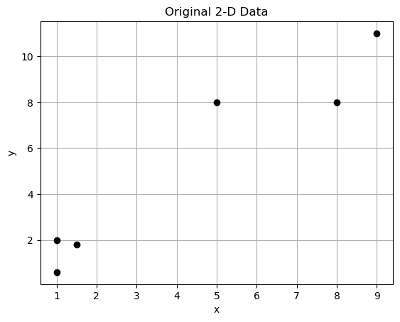
Our data is two dimensional - there are two features labeled x-feature and y-feature. Each observation can be represented as a vector of length two
[1, 2]
[1.5, 1.8]
[5, 8]
[8, 8]
[1, 0.6]
[9, 11]
Now let’s say that we want to reduce this two dimensional data down to a line (1D). But we don’t want to lose the clear separation between the points.
PCA - Centering and Normalizing the data
PCA is very affected by the scale of the data and subtracting the mean of each feature centers the data so that each feature has a mean of zero.
It is also good practice in machine learning to restrict the magnitude of your data to the range \([-1,1]\). There is not one unique way to normalize your data! We will use
\[\bar{x_i} = \frac{x_i-\mu_x}{\sigma_x}\]
Notice that we are subtracting the mean and dividing by the standard deviation. We apply this to each feature independently. This should remind you of the \(z\) score from probability!
# Find the mean of each feature
xmean = DF['x-feature'].mean()
ymean = DF['y-feature'].mean()
xstdv = DF['x-feature'].std()
ystdv = DF['y-feature'].std()

DF['x-centered'] = (DF['x-feature']-xmean)/xstdv
DF['y-centered'] = (DF['y-feature']-ymean)/ystdvDF| x-feature | y-feature | x-centered | y-centered | |
|---|---|---|---|---|
| 0 | 1.0 | 2.0 | -0.895381 | -0.752657 |
| 1 | 1.5 | 1.8 | -0.757630 | -0.799214 |
| 2 | 5.0 | 8.0 | 0.206626 | 0.644026 |
| 3 | 8.0 | 8.0 | 1.033132 | 0.644026 |
| 4 | 1.0 | 0.6 | -0.895381 | -1.078550 |
| 5 | 9.0 | 11.0 | 1.308634 | 1.342368 |
PCA - Preserve the Variance
Next we want to calculate the covariance matrix to capture how each of the features in the data vary together. If the data set has n-features, then the result of this will be an nXn square matrix.
We have calculated the covariance before using
np.cov()covariance_matrix = np.cov(DF['x-centered'],DF['y-centered'])
# Create the heatmap using matplotlib
plt.figure(figsize=(6, 5))
plt.imshow(covariance_matrix, cmap='coolwarm', interpolation='nearest')
# Add annotations
for i in range(covariance_matrix.shape[0]):
for j in range(covariance_matrix.shape[1]):
plt.text(j, i, f'{covariance_matrix[i, j]:.2f}',
ha="center", va="center", color="white" if abs(covariance_matrix[i, j]) > 15 else "black")
# Set labels and title
plt.xticks(np.arange(covariance_matrix.shape[1]), ['Feature 1', 'Feature 2'])
plt.yticks(np.arange(covariance_matrix.shape[0]), ['Feature 1', 'Feature 2'])
plt.title('Heatmap of Covariance Matrix (Matplotlib)')
plt.colorbar(label='Covariance Value')
plt.tight_layout()
plt.show()
covariance_matrix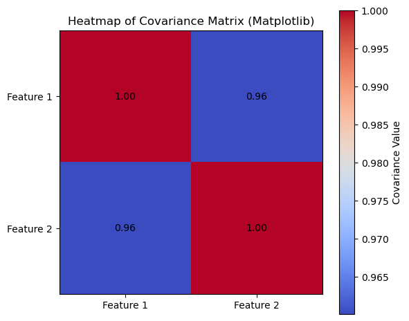
array([[1.        , 0.96004897],
       [0.96004897, 1.        ]])
PCA - Eigenvalue Decomposition
Next we want to use our covariance matrix and find the eigenvalues and eigenvectors of this matrix.
\[COV=\begin{bmatrix} 1. & 0.96004897\\ 0.96004897& 1. \end{bmatrix}\]
Eigenvectors indicate the directions of maximum variance in the data (the principal components), while eigenvalues quantify the variance captured by each principal component.
eigenvalues, eigenvectors = np.linalg.eig(covariance_matrix)

print("EIGENVALUES")
print(eigenvalues)

print("EIGENVECTORS")
print(eigenvectors)
EIGENVALUES
[1.96004897 0.03995103]
EIGENVECTORS
[[ 0.70710678 -0.70710678]
[ 0.70710678 0.70710678]]plot_eigenvectors(eigenvectors,eigenvalues)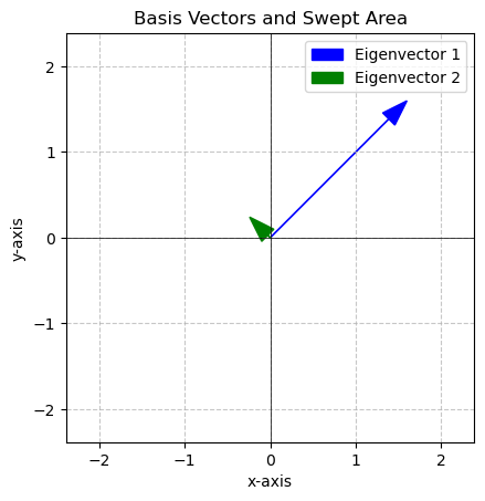
Here we see that one of the eigenvalues is MUCH bigger than the other!
\[\lambda_1 = 1.96004897\]
\[\vec{v_1} = \begin{bmatrix} 0.70710678 \\ 0.70710678 \end{bmatrix}\]
The blue eigenvector points in the direction with the most variance, the green eigenvector points in the direction of the second most (in this case the least) variance.
PCA - Component Selection
The eigenvalues tell us about the data’s variance the eigenvector tells us the direction. We often make a bar plot of the eigenvalues in descending order.
# Make some nice labels
labels = [f'PCA{i+1}' for i in range(len(eigenvalues))]

# Sort the eigenvalues and corresponding labels in descending order
sorted_indices = np.argsort(eigenvalues)[::-1]
sorted_eigenvalues = eigenvalues[sorted_indices]
sorted_labels = [labels[i] for i in sorted_indices]

# Create the bar plot
plt.figure(figsize=(8, 6))
plt.bar(sorted_labels, sorted_eigenvalues, color='skyblue')

# Add labels and title
plt.xlabel('Eigenvectors (in descending order of magnitude)')
plt.ylabel('Eigenvalue Magnitude')
plt.title('Bar Plot of Eigenvector Magnitudes (Descending Order)')
plt.grid(axis='y', linestyle='--')
plt.ylim(0, max(eigenvalues) * 1.1)  # Adjust y-axis limits for better visualization

# Add text labels for the values on top of the bars
for i, v in enumerate(sorted_eigenvalues):
    plt.text(i, v + 0.01, f'{v:.4f}', ha='center', va='bottom')

# Show the plot
plt.tight_layout()
plt.show()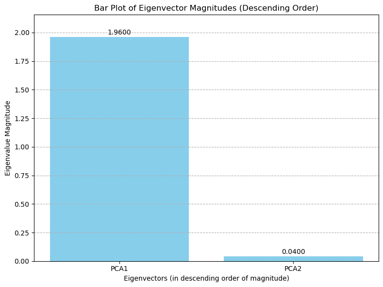
Looking at this bar plot we select the principal components with the most variance. In this two dimensional case we will choose just PCA1, and reduce our data down to one dimension.
In higher dimensional cases we can choose how many dimensions to project down to by choosing the number of principal components.
PCA - Project the Data
We are ready to project the data using a matrix multiplication. To do this we multiply the data vectors by the matrix of eigenvectors corresponding to the principal components we choose.
\[\vec{x}_{proj} = \vec{x}\cdot\tilde{Q}\]
Since we are projecting into one dimension our projection matrix is given by
\[\tilde{Q} = \begin{bmatrix} 0.70710678 \\ 0.70710678 \end{bmatrix}\]
So for the very first data point \[\vec{x} = \begin{bmatrix} 1 & 2 \end{bmatrix}\]
we can calculate the projected point as
\[\vec{x}_{proj} = \begin{bmatrix} -0.89538136& -0.75265747 \end{bmatrix}\begin{bmatrix} 0.70710678 \\ 0.70710678 \end{bmatrix}\]
     $$= -0.89538136*0.70710678+-0.75265747*0.70710678$$

     $$= -1.1653394311885341$$
Do this same operation to each vector in our set of normalized observations
observations = DF[['x-centered', 'y-centered']].values
observations
array([[-0.89538136, -0.75265747],
[-0.75763038, -0.7992136 ],
[ 0.20662647, 0.6440265 ],
[ 1.03313234, 0.6440265 ],
[-0.89538136, -1.0785504 ],
[ 1.3086343 , 1.34236848]])x_proj = []
Q = np.array([0.70710678, 0.70710678])
for x in observations:
x_proj.append(x @ Q)
x_proj
[-1.1653394311885341,
 -1.1008549371158458,
 0.6015024779757782,
 1.185930382924984,
 -1.3957805284537876,
 1.874542035857405]
# Make a line plot
y = np.zeros(len(x_proj))
plt.figure(figsize=(10, 2)) # Adjust figure size as needed
plt.scatter(x_proj, y, s=100, marker='o', color='black',alpha=.5) #plot points
plt.yticks([]) # Hide y-axis ticks
plt.xlabel("Data Projected onto Line")
plt.axhline(0, color='black', linewidth=0.8) #draw the numberline
plt.grid(True, axis='x', linestyle='--', alpha=0.6) #add grid for x-axis
plt.show()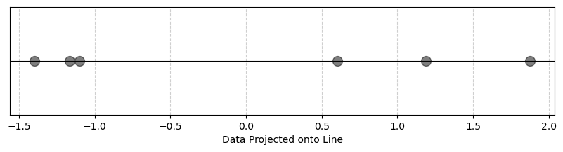
Here you see that we preserved the idea that the points were clearly separated in space even though we reduced the dimensions!
PCA - Summary
Principal component analysis leverages the eigenvalues and eigenvectors of the covariance matrix to find directions along which we can project our data to reduce the dimension.
PCA - Python Code
We can use tools from sklearn to automate this process!
from sklearn.decomposition import PCA
from sklearn.preprocessing import StandardScaler
# Import the raw data
filename='data/PCAsimple.csv'
DF = pd.read_csv(filename)
DF| x-feature | y-feature | |
|---|---|---|
| 0 | 1.0 | 2.0 |
| 1 | 1.5 | 1.8 |
| 2 | 5.0 | 8.0 |
| 3 | 8.0 | 8.0 |
| 4 | 1.0 | 0.6 |
| 5 | 9.0 | 11.0 |
np.random.seed(42) # for reproducibility
# Select the features.
features = ['x-feature', 'y-feature']
# Normalize the data
# Z-score normalization
scalar = StandardScaler()
inputs = scalar.fit_transform(DF[features])
# Create the model
model = PCA(n_components=1)
x_proj = model.fit_transform(inputs)
# Make a line plot
y = np.zeros(len(x_proj))
plt.figure(figsize=(10, 2))  # Adjust figure size as needed
plt.scatter(x_proj, y, s=100, marker='o', color='black',alpha=.5) #plot points
plt.yticks([])  # Hide y-axis ticks
plt.xlabel("Data Projected onto Line")
plt.axhline(0, color='black', linewidth=0.8) #draw the numberline
plt.grid(True, axis='x', linestyle='--', alpha=0.6) #add grid for x-axis
plt.show()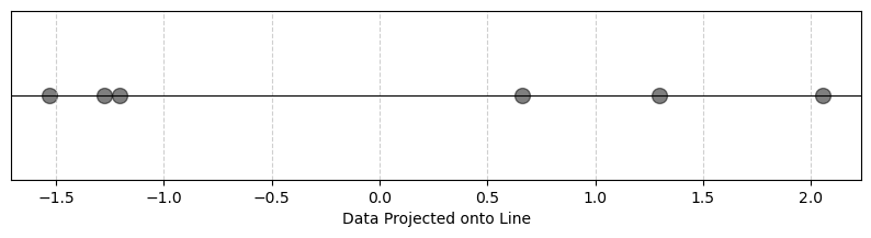
# You can look at the eigenvectors
model.components_
array([[0.70710678, 0.70710678]])# Look at the eigenvalue
model.explained_variance_array([2.35205876])# You can ask what proportion of the variance
# in the original data set is
# captured by the component
# Higher is better!
model.explained_variance_ratio_array([0.98002448])Applied Example
Next we will consider a famous data set, the Diagnostic Wisconsin Breast Cancer Database.
https://archive.ics.uci.edu/dataset/17/breast+cancer+wisconsin+diagnostic
In this data set is information about diagnostic images of breast masses along with labels telling us if the mass was cancerous or not. It is a famous data set used to learn about binary classification and PCA.
Load the data
from sklearn.datasets import load_breast_cancer
cancer = load_breast_cancer()
DF = pd.DataFrame(cancer.data,columns=cancer.feature_names)
DF[cancer.target_names[0]] = cancer.target
DF| mean radius | mean texture | mean perimeter | mean area | mean smoothness | mean compactness | mean concavity | mean concave points | mean symmetry | mean fractal dimension | ... | worst texture | worst perimeter | worst area | worst smoothness | worst compactness | worst concavity | worst concave points | worst symmetry | worst fractal dimension | malignant | |
|---|---|---|---|---|---|---|---|---|---|---|---|---|---|---|---|---|---|---|---|---|---|
| 0 | 17.99 | 10.38 | 122.80 | 1001.0 | 0.11840 | 0.27760 | 0.30010 | 0.14710 | 0.2419 | 0.07871 | ... | 17.33 | 184.60 | 2019.0 | 0.16220 | 0.66560 | 0.7119 | 0.2654 | 0.4601 | 0.11890 | 0 |
| 1 | 20.57 | 17.77 | 132.90 | 1326.0 | 0.08474 | 0.07864 | 0.08690 | 0.07017 | 0.1812 | 0.05667 | ... | 23.41 | 158.80 | 1956.0 | 0.12380 | 0.18660 | 0.2416 | 0.1860 | 0.2750 | 0.08902 | 0 |
| 2 | 19.69 | 21.25 | 130.00 | 1203.0 | 0.10960 | 0.15990 | 0.19740 | 0.12790 | 0.2069 | 0.05999 | ... | 25.53 | 152.50 | 1709.0 | 0.14440 | 0.42450 | 0.4504 | 0.2430 | 0.3613 | 0.08758 | 0 |
| 3 | 11.42 | 20.38 | 77.58 | 386.1 | 0.14250 | 0.28390 | 0.24140 | 0.10520 | 0.2597 | 0.09744 | ... | 26.50 | 98.87 | 567.7 | 0.20980 | 0.86630 | 0.6869 | 0.2575 | 0.6638 | 0.17300 | 0 |
| 4 | 20.29 | 14.34 | 135.10 | 1297.0 | 0.10030 | 0.13280 | 0.19800 | 0.10430 | 0.1809 | 0.05883 | ... | 16.67 | 152.20 | 1575.0 | 0.13740 | 0.20500 | 0.4000 | 0.1625 | 0.2364 | 0.07678 | 0 |
| ... | ... | ... | ... | ... | ... | ... | ... | ... | ... | ... | ... | ... | ... | ... | ... | ... | ... | ... | ... | ... | ... |
| 564 | 21.56 | 22.39 | 142.00 | 1479.0 | 0.11100 | 0.11590 | 0.24390 | 0.13890 | 0.1726 | 0.05623 | ... | 26.40 | 166.10 | 2027.0 | 0.14100 | 0.21130 | 0.4107 | 0.2216 | 0.2060 | 0.07115 | 0 |
| 565 | 20.13 | 28.25 | 131.20 | 1261.0 | 0.09780 | 0.10340 | 0.14400 | 0.09791 | 0.1752 | 0.05533 | ... | 38.25 | 155.00 | 1731.0 | 0.11660 | 0.19220 | 0.3215 | 0.1628 | 0.2572 | 0.06637 | 0 |
| 566 | 16.60 | 28.08 | 108.30 | 858.1 | 0.08455 | 0.10230 | 0.09251 | 0.05302 | 0.1590 | 0.05648 | ... | 34.12 | 126.70 | 1124.0 | 0.11390 | 0.30940 | 0.3403 | 0.1418 | 0.2218 | 0.07820 | 0 |
| 567 | 20.60 | 29.33 | 140.10 | 1265.0 | 0.11780 | 0.27700 | 0.35140 | 0.15200 | 0.2397 | 0.07016 | ... | 39.42 | 184.60 | 1821.0 | 0.16500 | 0.86810 | 0.9387 | 0.2650 | 0.4087 | 0.12400 | 0 |
| 568 | 7.76 | 24.54 | 47.92 | 181.0 | 0.05263 | 0.04362 | 0.00000 | 0.00000 | 0.1587 | 0.05884 | ... | 30.37 | 59.16 | 268.6 | 0.08996 | 0.06444 | 0.0000 | 0.0000 | 0.2871 | 0.07039 | 1 |
569 rows × 31 columns
This data has 30 features and 1 target. The features are the first 30 column labels and they include things like
'mean radius', 'mean texture', 'mean perimeter', 'mean area',
   'mean smoothness', 'mean compactness', 'mean concavity',
   'mean concave points', 'mean symmetry' ...
the target is a column with a 1 or 0 saying whether the doctor found something that was malignant.
Visualization?
How can we visualize these numbers? Each observation (and there are 569 observations) consists of 30 features.
Look at just one observation
DF.iloc[0][cancer.feature_names]mean radius 17.990000
mean texture 10.380000
mean perimeter 122.800000
mean area 1001.000000
mean smoothness 0.118400
mean compactness 0.277600
mean concavity 0.300100
mean concave points 0.147100
mean symmetry 0.241900
mean fractal dimension 0.078710
radius error 1.095000
texture error 0.905300
perimeter error 8.589000
area error 153.400000
smoothness error 0.006399
compactness error 0.049040
concavity error 0.053730
concave points error 0.015870
symmetry error 0.030030
fractal dimension error 0.006193
worst radius 25.380000
worst texture 17.330000
worst perimeter 184.600000
worst area 2019.000000
worst smoothness 0.162200
worst compactness 0.665600
worst concavity 0.711900
worst concave points 0.265400
worst symmetry 0.460100
worst fractal dimension 0.118900
Name: 0, dtype: float64This is why it is hard to visualize high dimensional data.
Is there something in the data (variance) that can tell me something about whether or not we see cancer in a patient?
If we want to actually visualize on a graph this we need to reduce it to 3 or fewer dimensions. This is not always successful for visualization even if PCA works. But it is usually worth a try!
Here is what we will do:
- Take the features and normalize them
- Run them through PCA and try to project them onto the 2d plane
- Plot the resulting vectors (scatter plot)
- The color the points by the label (malignant)
- Ask if we see a pattern.
NOTE We don’t need any labels to be able to do PCA, we just add them at the end to make our graph pretty!
np.random.seed(42)  # for reproducibility

# Select the features - CHANGE BASED ON YOUR DATA
features = cancer.feature_names

# Normalize the data
# Z-score normalization
scalar = StandardScaler()
inputs = scalar.fit_transform(DF[features].values) #CHANGE BASED ON YOUR DATA

# Create the model
model = PCA(n_components=2) #CHANGE BASED ON NUMBER OF COMPONENTS YOU WANT
x_proj = model.fit_transform(inputs)

# Make a scatter plot
plt.figure(figsize=(8, 6))  # Adjust figure size as needed
# Color the plot based on malignant or not
color = ['red' if i==1 else 'blue' for i in DF['malignant'] ]
plt.scatter(x_proj[:,0], x_proj[:,1], c=color) #plot points
plt.xlabel("Data Projected onto 2D")
plt.axhline(0, color='black', linewidth=0.8) #draw the numberline
plt.grid(True, axis='x', linestyle='--', alpha=0.6) #add grid for x-axis
plt.show()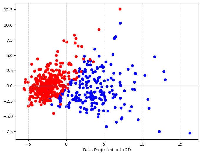
Lets look at the eigenvalues! How many do you expect?
print('Eigenvalues:')
print(list(model.components_[0]))
print(list(model.components_[1]))
Eigenvalues:
[0.21890244370000278, 0.10372457821570166, 0.22753729300562497, 0.2209949853859397, 0.14258969436024088, 0.2392853539529943, 0.2584004812487666, 0.2608537583857381, 0.13816695930364045, 0.0643633463717741, 0.20597877585525437, 0.017428028148954108, 0.2113259163754939, 0.20286963544140427, 0.014531452147830873, 0.17039345120745547, 0.15358978973979215, 0.18341739696413573, 0.042498421633042884, 0.10256832209558289, 0.2279966342324755, 0.10446932545719613, 0.23663968074164696, 0.22487053273420826, 0.12795256119286477, 0.21009588015782346, 0.2287675328150073, 0.25088597121800116, 0.12290455637797504, 0.131783942877962]
[-0.23385713174765568, -0.05970608828045006, -0.21518136139490737, -0.23107671128277196, 0.18611302266359944, 0.1518916100911611, 0.06016536281254795, -0.03476750048720091, 0.19034877039713066, 0.3665754713792319, -0.10555215182884951, 0.08997968181919544, -0.08945723421956006, -0.15229262810396776, 0.20443045304782803, 0.2327158962000378, 0.19720728270592064, 0.13032155988956728, 0.1838479999334048, 0.2800920265952772, -0.21986637930803465, -0.04546729827559551, -0.1998784279455257, -0.21935185793017065, 0.1723043516361846, 0.14359317328188778, 0.0979641143418798, -0.00825723507946853, 0.14188334858599616, 0.2753394685719068]Let’s look at the explained variance. What do these numbers mean?
print(f'Explained Variance: {model.explained_variance_ratio_}')Explained Variance: [0.44272026 0.18971182]Summary
After doing PCA, we see that when we project the data from 30 dimensions onto the 2D plane and the color by the label, there are two fairly clear clusters that distinguish between malignant and not. This is good news if we hope to create a binary classifier!
We have 2 eigenvectors each of lenth 30. The the variance that is explained by the two principal components is \(0.44272026+0.18971182=0.63243208\), so more than 60% of the variance in the data is described by these two components!
You Try
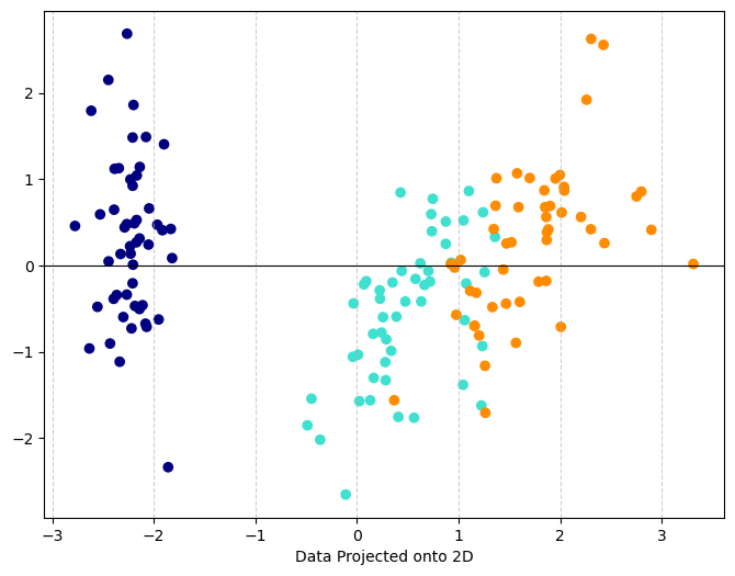
Our next very famous data set is the Iris data. This is a set of 150 observations of irises (flowers) along with measurements describing the flower. There are three types of flowers in the data set that have been assigned colors that you can use in the final graph:
- setosa = navy
- versicolor = turquoise
- virginica = darkorange
Load the data set and make a list of the features. How many features are there? How many labels?
Alter the code that we used for the breast cancer data so that it applies to the iris data (remember we changed the name DF –> DF_iris). This should result in a plot of your features projected onto the plane. You will need to change the color line to:
color = DF_iris['color']Produce the explained variance ratio. What does this tell you?
Summarize what you find in your results.
# Run this code to load the data
from sklearn.datasets import load_iris
iris = load_iris()
DF_iris = pd.DataFrame(iris.data,columns=iris.feature_names)
# Get colors associated with each name
names = iris.target_names
colors = ['navy', 'turquoise', 'darkorange']
color_list = [colors[i] for i in iris.target]
# Add the colors to the data
DF_iris['color'] = color_list
DF_iris| sepal length (cm) | sepal width (cm) | petal length (cm) | petal width (cm) | color | |
|---|---|---|---|---|---|
| 0 | 5.1 | 3.5 | 1.4 | 0.2 | navy |
| 1 | 4.9 | 3.0 | 1.4 | 0.2 | navy |
| 2 | 4.7 | 3.2 | 1.3 | 0.2 | navy |
| 3 | 4.6 | 3.1 | 1.5 | 0.2 | navy |
| 4 | 5.0 | 3.6 | 1.4 | 0.2 | navy |
| ... | ... | ... | ... | ... | ... |
| 145 | 6.7 | 3.0 | 5.2 | 2.3 | darkorange |
| 146 | 6.3 | 2.5 | 5.0 | 1.9 | darkorange |
| 147 | 6.5 | 3.0 | 5.2 | 2.0 | darkorange |
| 148 | 6.2 | 3.4 | 5.4 | 2.3 | darkorange |
| 149 | 5.9 | 3.0 | 5.1 | 1.8 | darkorange |
150 rows × 5 columns
# Run this code to get the exact name of the columns
DF_iris.keys()
Index(['sepal length (cm)', 'sepal width (cm)', 'petal length (cm)',
'petal width (cm)', 'color'],
dtype='object')Code
np.random.seed(42)  # for reproducibility

# Select the features - CHANGE BASED ON YOUR DATA
features = ['sepal length (cm)', 'sepal width (cm)', 'petal length (cm)',
       'petal width (cm)']

# Normalize the data
# Z-score normalization
scalar = StandardScaler()
inputs = scalar.fit_transform(DF_iris[features].values) #CHANGE BASED ON YOUR DATA

# Create the model
model = PCA(n_components=2) #CHANGE BASED ON NUMBER OF COMPONENTS YOU WANT
x_proj = model.fit_transform(inputs)

# Make a scatter plot
plt.figure(figsize=(8, 6))  # Adjust figure size as needed
# Color the plot based on malignant or not
color = DF_iris['color']
plt.scatter(x_proj[:,0], x_proj[:,1], c=color) #plot points
plt.xlabel("Data Projected onto 2D")
plt.axhline(0, color='black', linewidth=0.8) #draw the numberline
plt.grid(True, axis='x', linestyle='--', alpha=0.6) #add grid for x-axis
plt.show()