# We will just go ahead and import all the useful packages first.
import numpy as np
import sympy as sp
import pandas as pd
import matplotlib.pyplot as plt

# Special Functions
from sklearn.metrics import r2_scoreMath for Data Science
Curvilinear Models and Summations
Important Information
- Email: joanna_bieri@redlands.edu
- Office Hours take place in Duke 209 unless otherwise noted – Office Hours Schedule
Today’s Goals:
- Continue Empirical Modeling
- Cataloging Functions and Transformations.
- Nonlinear Models - Linearization
- Summation Notation
Empirical Modeling with Nonlinear Functions
NON-LINEAR - Square \[ y = f(x) = ax^2 +b \] - Square Root \[ y = f(x) = a\sqrt{x} +b\] - Absolute Value \[ y = f(x) = a|x|+b\] - Polynomials higher than degree 1 \[ y = f(x) = a_0 + a_1x + a_2x^2+a_3x^3+\dots\] - Sine \[ y = f(x) = a\sin(bx)+c\] - Cosine \[ y = f(x) = a\cos(bx)+c\]
NOTE We will save Exponential and Logarithmic Functions for a day of their own.
Exploring Nonlinear Curves
Powers of \(x\)
We will start by considering functions that are powers of \(x^n\) where \(n\) can be any real number, but typically we think of it as an integer \(n = \pm1, \pm2, pm3\) or a fraction \(n = \frac{1}{m}\) where \(m\) is an integer. This includes the polynomials and square roots. Here are our big questions:
- What does the power do to the shape of the function?
- How fast do these increase or decrease as \(x\) gets large?
- How can we shift them: up, down, left, right?
- How can we stretch or compress them?
# Powers of x
'''
This is much more advanced code than I would ever expect you to use in this class!

I wanted to leave it visable just so you can see how I create the images.
'''

# Get my x-values
x = np.arange(0,4,0.01)

# Define all the functions I wwant to plot
functions = [
    lambda x: x**(1/4),
    lambda x: x**(1/3),
    lambda x: x**(1/2),
    lambda x: x,
    lambda x: x**(2),
    lambda x: x**(3),
    lambda x: x**(4),
]

# Labels
n_vals = ['x^1/4','x^1/3','x^1/2','x','x^2','x^3','x^4']

# Colors
N = len(n_vals)  # Number of colors you want
cmap = plt.get_cmap('viridis')  # Choose your colormap
colors = [cmap(i / N) for i in range(N)] # Get a list of colors


# Plot all the functions
i=0
for f in functions:
    lbl = n_vals[i]
    c = colors[i]
    plt.plot(x,f(x),color=c,label=lbl)
    i+=1

# Add a legend
plt.legend()
# Y-axis limits
plt.ylim(-.1,4)
plt.xlim(-.1,4)
plt.grid()
plt.show()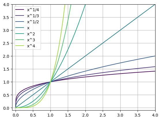
# Choose just one to plot
'''
This is more like what I expect you to be able to do!
'''


x = np.arange(0,4,0.01)
n = 1/2
f = x**n

plt.plot(x,f,color='red',label='x^1/2')
plt.legend()
plt.ylim(0,4)
plt.xlim(0,4)
plt.grid()
plt.show()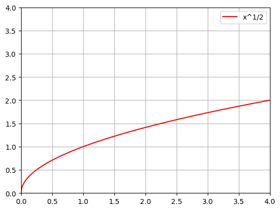
Transforming Powers of \(x\)
What we noticed about each of the funtions above:
- Increasing the power of the exponent in the polynomial changes the shape.
- \(x\) < 1 the functions slope (incline) decreases as \(x\) increases.
- \(x\) > 1 the functions slope (incline) increases as \(x\) increases.
- As \(x\) increases they all keep increasing.
- They all go through \((0.0)\)
How could we change some of the shape given a single function? Lets redo the plot of
\[y=\sqrt{x}\]
that we did above, but transform it!
\[y=a\sqrt{x-b}+c\]
Here \(a\) will stretch or compress the curve, \(b\) will shift the curve left or right, and \(c\) will move it up and down.
# Choose your a, b, c
a=1
b=0
c=0

x = np.arange(0,4,0.01)
n = 1/2
f = a*(x-b)**n+c

plt.plot(x,f,color='red',label='x^1/2')
plt.legend()
plt.ylim(0,4)
plt.xlim(0,4)
plt.grid()
plt.show()
Questions:
- How would you create a square root function that “starts” at the point \((2,3)\)?
- Why does Python give you an error if you choose \(b=1\) and have your \(x\)-values going from \((0,4)\)?
- How would you fit the following function: \[y = a\sqrt{x}+c\] so that it goes through the points \((1,0)\) and \((4,4)\)?
NOTE: It is interesting that in questions 3 we were solving a linear system of equations even though we were fitting a nonlinear curve!
General Transformations
- If we know the graph of \(f(x)\) then
- we can shift it to the right \(b\) units by using \(f(x-b)\).
- we can stretch it vertically by multiplying by \(a\) when \(a>1\)
- we can shrink it vertically by multiplying by \(a\) when \(a<1\)
- we can move it up an down by adding \(c\) to it.
You Try!
Choose one of the other \(x^n\) style functions and do the following:
- Imagine what you want the graph to look like: shifted, stretched, moved, etc…
- Draw a rough sketch of what you think your new function will look like.
- Plot your function using Pyhton. How close was your sketch?
Integer Powers of \(x\)
If we restrict ourselves to powers of \(x\) then we can start to see some other shapes!
Positive \(n\)
# Positive n values
'''
This is much more advanced code than I would ever expect you to use in this class!

I wanted to leave it visable just so you can see how I create the images.
'''

# Get my x-values
x = np.arange(-2,2,0.01)

# Define all the functions I wwant to plot
functions = [
    lambda x: x,
    lambda x: x**(2),
    lambda x: x**(3),
    lambda x: x**(4),
    lambda x: x**(5),
    lambda x: x**(6)
]

# Labels
n_vals = ['x','x^2','x^3','x^4','x^5','x^6']

# Colors
N = len(n_vals)  # Number of colors you want
cmap = plt.get_cmap('viridis')  # Choose your colormap
colors = [cmap(i / N) for i in range(N)] # Get a list of colors


# Plot all the functions
i=0
for f in functions:
    lbl = n_vals[i]
    c = colors[i]
    plt.plot(x,f(x),color=c,label=lbl)
    i+=1

# Add a legend
plt.legend()
# Y-axis limits
plt.ylim(-2,2)
plt.xlim(-2,2)
plt.grid()
plt.show()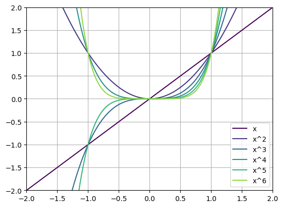
Even Functions are functions that are equal when reflected across \(x=0\). You could fold them in half along \(x=0\) and they would overlap.
Odd Functions are functions that are opposite when reflected across \(x=0\). You could fold them in half along \(x=0\) and they would NOT overlap.
Questions:
- Which of the functions above are even? Which are odd?
- Do you see a pattern?
Negative \(n\)
# Negative n values
'''
This is much more advanced code than I would ever expect you to use in this class!

I wanted to leave it visable just so you can see how I create the images.
'''

# Get my x-values
x = np.arange(-4,4,.01)

# Define all the functions I wwant to plot
functions = [
    lambda x: x**(-1),
    lambda x: x**(-2),
    lambda x: x**(-3),
    lambda x: x**(-4),
    lambda x: x**(-5),
    lambda x: x**(-6)
]

# Labels
n_vals = ['x^-1','x^-2','x^-3','x^-4','x^-5','x^-6']

# Colors
N = len(n_vals)  # Number of colors you want
cmap = plt.get_cmap('viridis')  # Choose your colormap
colors = [cmap(i / N) for i in range(N)] # Get a list of colors


# Plot all the functions
i=0
for f in functions:
    lbl = n_vals[i]
    c = colors[i]
    plt.plot(x,f(x),color=c,label=lbl)
    i+=1

# Add a legend
plt.legend()
# Y-axis limits
plt.ylim(-10,10)
plt.xlim(-4,4)
plt.grid()
plt.show()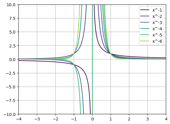
Questions:
- Can we talk about even and odd functions here?
- What happens as \(x\) gets really small?
- What is happening across \(x=0\)?
Lets look at some data
Here is data that records the daily temperature and the number of units of ice cream sold for that day.
file_location = 'https://joannabieri.com/mathdatascience/data/Ice_cream_data.csv'
DF = pd.read_csv(file_location)

DF.head(10)| Temperature (°C) | Ice Cream Sales (units) | |
|---|---|---|
| 0 | -4.662263 | 41.842986 |
| 1 | -4.316559 | 34.661120 |
| 2 | -4.213985 | 39.383001 |
| 3 | -3.949661 | 37.539845 |
| 4 | -3.578554 | 32.284531 |
| 5 | -3.455712 | 30.001138 |
| 6 | -3.108440 | 22.635401 |
| 7 | -3.081303 | 25.365022 |
| 8 | -2.672461 | 19.226970 |
| 9 | -2.652287 | 20.279679 |
x = np.array(DF['Temperature (°C)'])
y = np.array(DF['Ice Cream Sales (units)'])

# Make a scatter plot
plt.plot(x,y,'k.')
plt.title('Ice Cream Sales vs. Temperature C')
plt.xlabel('Temperature')
plt.ylabel('Units Sold')
plt.grid()
plt.show()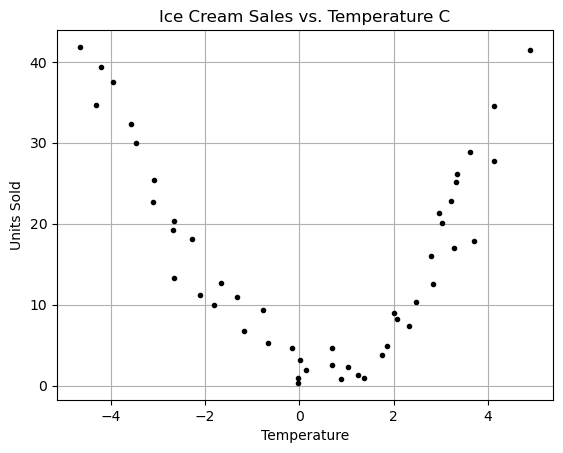
Questions:
After looking at the graph answer the following questions:
- Can we use a linear regression?
- Should we use a linear regression?
- What function seems to kindof fit this data? Can you come up with a guess of the function of best fit?
Lets try a linear regression (brute force)
np.corrcoef(x,y)[0,1]-0.17518429270784366betas = np.polyfit(x,y,1)
betasarray([-0.79645711, 16.12174939])yfit = betas[0]*x+betas[1]
plt.plot(x,y,'k.')
plt.plot(x,yfit,'b-')
plt.xlabel('x')
plt.ylabel('y')
plt.show()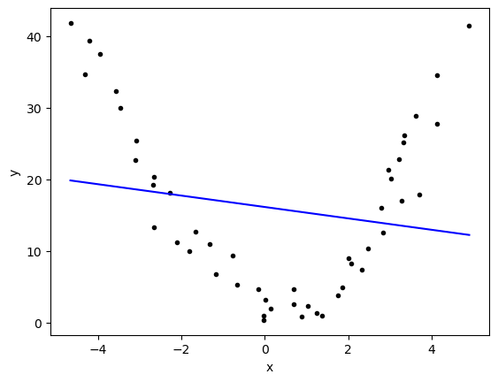
r2_score(y,yfit)0.030689536411547258It worked!!! BUT….
Questions:
- Are we happy with this fit?
- What do all those numbers/graphs mean to you?
- What went wrong?
Nonlinear Models - Linearization
Even though the model above is nonlinear we can still technically use linear regression. BUT HOW?
We think of linear regression in one variable (1D) as using just a straight line:
\[ y = \beta_0 + \beta_1x \]
but what we have above is something more like
\[ y = \beta_0 + \beta_1 x^2\]
What if we just imagine that our data had another column that was just the temperature squared:
DF['Temperature Squared (°C^2)'] = x**2
DF.head(10)| Temperature (°C) | Ice Cream Sales (units) | Temperature Squared (°C^2) | |
|---|---|---|---|
| 0 | -4.662263 | 41.842986 | 21.736693 |
| 1 | -4.316559 | 34.661120 | 18.632685 |
| 2 | -4.213985 | 39.383001 | 17.757668 |
| 3 | -3.949661 | 37.539845 | 15.599823 |
| 4 | -3.578554 | 32.284531 | 12.806047 |
| 5 | -3.455712 | 30.001138 | 11.941943 |
| 6 | -3.108440 | 22.635401 | 9.662400 |
| 7 | -3.081303 | 25.365022 | 9.494430 |
| 8 | -2.672461 | 19.226970 | 7.142047 |
| 9 | -2.652287 | 20.279679 | 7.034625 |
What does a scatter plot of \(y\) vs \(x^2\) look like?
x = np.array(DF['Temperature (°C)'])
y = np.array(DF['Ice Cream Sales (units)'])
xsqr = x**2

# Make a scatter plot
plt.plot(xsqr,y,'k.')
plt.title('Ice Cream Sales vs. Square Temperature C^2')
plt.xlabel('Square Temperature')
plt.ylabel('Units Sold')
plt.grid()
plt.show()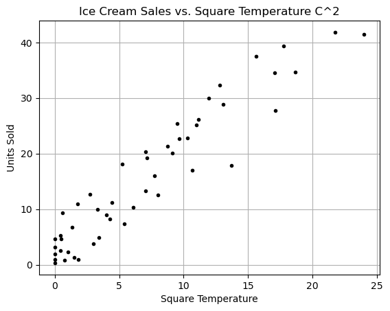
WOW! This looks almost linear… we could do a linear regression if we just squared the temperature!!
The linearized model
So lets look at the nonlinear model:
\[ y = \beta_0 + \beta_1 x + \beta_2 x^2\]
This thing is linear in \(\beta\). Instead we could try to predict the Ice Cream Sales using both the temperature and the temperature squared? Just treat them each as separate variables (even though we secretly know they are related). This would be more like
\[ y = \beta_0 + \beta_1 x_1 + \beta_2 x_2\]
we could “trick” linear regression into doing nonlinear regression! This is what polyfit does when we tell it we want a second order polynomial.
{python] np.polyfit(x,y,2)
x = np.array(DF['Temperature (°C)'])
y = np.array(DF['Ice Cream Sales (units)'])

betas = np.polyfit(x,y,2)
betas
array([ 1.82952623, -0.82468167, 2.95177416])yfit = betas[0]*x**2+betas[1]*x+betas[2]
plt.plot(x,y,'k.')
plt.plot(x,yfit,'b-')
plt.xlabel('x')
plt.ylabel('y')
plt.show()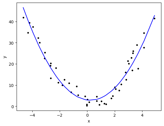
r2_score(y,yfit)0.9321137090423876This is a much better result!
Pause for a second - Summation Notation
Often mathematicians try to write things down in beautiful and compact notation. When we are doing general linear regression we could have as many variables as we want (aka as many dimensions). It gets really annoying to write out
\[ y = \beta_0 + \beta_1x_1 + \beta_2x_2+ \beta_3x_3+ \beta_4x_4+ \beta_5x_5+ \dots\]
Imagine if you had 100 variables! Summation notation makes this much easier to write (okay a little harder to understand at first)
\[y = \beta_0+\sum_{i=1}^{100} \beta_1 x_i \]
This is how we might write out the idea of a polynomial regression:
\[y=\sum_{i=0}^{10} \beta_i x^i \]
Questions:
- What is this sum if your write it out long hand?
- Try writing out the terms in this sum \[\sum_{n=2}^{5} (-1)^n x^n \]
- Can you change this from long hand to summation notation? \[ y = 2 + 4x + 8x^2 + 16x^3 + 32x^4 \]
We will see more of this as we go on in class… but I wanted to start working in small doses!
Another measure of fit - Mean Squared Error
\(R^2\) measures the proportion of the total variation in the data that the model can explain. The values range from zero to one with higher being netter.
\(MSE\) or mean squared error measures the average squared difference between the predicted and actual values. Lower MSE values indicate better prediction accuracy.
\[MSE = \frac{1}{n} \sum_{i=1}^n (y_i-\hat{y}_i)^2 \]
we saw this before! This is the residual sum of squares divided by the number of data points.
from sklearn.metrics import mean_squared_error

mean_squared_error(y,yfit)10.003220594982494Higher order Polynomials
Why stop at \(x^2\) we have a computer we can go crazy!!!!
N = 3

betas = np.polyfit(x,y,N)
print(betas)

yfit = 0
for i,b in enumerate(betas):
    yfit += b*x**(N-i)

plt.plot(x,y,'k.')
plt.plot(x,yfit,'b-')
plt.xlabel('x')
plt.ylabel('y')
plt.show()

print(f'R squared: {r2_score(y,yfit)}')
print(f'MSE: {mean_squared_error(y,yfit)}')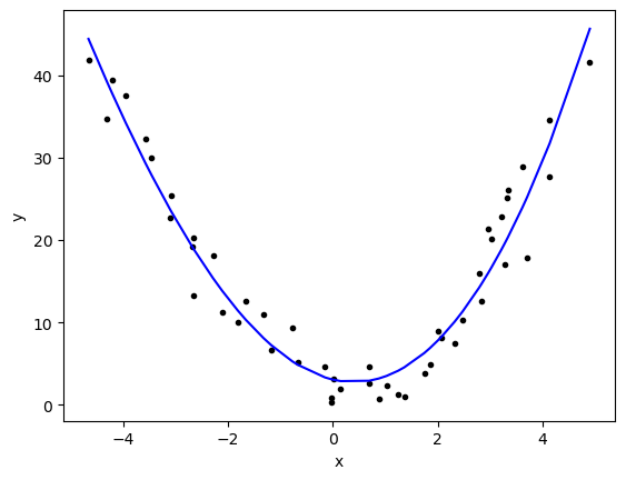
R squared: 0.9367011897445384
MSE: 9.32724344567126
What you will notice here is that our method does get better as we increase the order of our polynomial. Technically we could just draw a curve that goes through all the points (aka memorize our data!)
Questions;
- Rerun the code above for higher and higher order polynomials, do the results get better?
- Do you reach a point where making the model more complicated doesn’t actually improve the results that much?
Occams Razor -
from Wikipedia:
In philosophy, Occam’s razor (also spelled Ockham’s razor or Ocham’s razor; Latin: novacula Occami) is the problem-solving principle that recommends searching for explanations constructed with the smallest possible set of elements. It is also known as the principle of parsimony or the law of parsimony (Latin: lex parsimoniae). Attributed to William of Ockham, a 14th-century English philosopher and theologian, it is frequently cited as Entia non sunt multiplicanda praeter necessitatem, which translates as “Entities must not be multiplied beyond necessity”, although Occam never used these exact words. Popularly, the principle is sometimes paraphrased as “of two competing theories, the simpler explanation of an entity is to be preferred.”
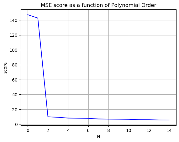
Our goal in modeling should be to increase the \(R^2\) value to be as close as possible to \(1\) and decrease the mean squared error to as close as possible to zero, without making our model ridiculously complicated. Stop before you get diminishing returns!
Nvals = np.arange(0,15)
Rscores = []
MSEscores = []

for N in Nvals:

    betas = np.polyfit(x,y,N)


    yfit = 0
    for i,b in enumerate(betas):
        yfit += b*x**(N-i)

    Rscores.append(r2_score(y,yfit))
    MSEscores.append(mean_squared_error(y,yfit))


plt.plot(Nvals,Rscores,'-r')
plt.grid()
plt.title('R^2 score as a function of Polynomial Order')
plt.xlabel('N')
plt.ylabel('score')
plt.show()

plt.plot(Nvals,MSEscores,'-b')
plt.grid()
plt.title('MSE score as a function of Polynomial Order')
plt.xlabel('N')
plt.ylabel('score')
plt.show()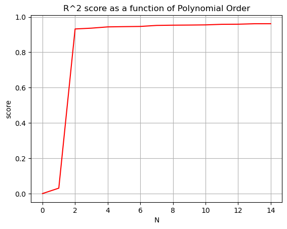
You Try
For next class you should start working on Homework 2. You should be able to do parts 1-4 since these are about linear and polynomial regression.