# We will just go ahead and import all the useful packages first.
import numpy as np
import sympy as sp
import pandas as pd
import matplotlib.pyplot as plt

# Special Functions
from sklearn.metrics import r2_score, mean_squared_errorMath for Data Science
Continue Curvilinear Models
Important Information
- Email: joanna_bieri@redlands.edu
- Office Hours take place in Duke 209 unless otherwise noted – Office Hours Schedule
Today’s Goals:
- Continue Empirical Modeling
- Nonlinear Models - Linearization
- Exponent and Log models
Last Time - Polynomial Regression
We looked at the ice cream data and did a polynomial regression! We wanted a quadratic function because of the shape of the data.
\[ y = \beta_0 + \beta_1 x + \beta_2 x^2\]
This thing was linear in \(\beta\). Instead we added \(x^2\) to data to our regression as if it were just another data point.
\[ y = \beta_0 + \beta_1 x_1 + \beta_2 x_2\]
we could “trick” linear regression into doing nonlinear regression! This is what polyfit does when we tell it we want a second order polynomial.
{python] np.polyfit(x,y,2)
file_location = 'https://joannabieri.com/mathdatascience/data/Ice_cream_data.csv'
DF = pd.read_csv(file_location)

DF.head(10)| Temperature (°C) | Ice Cream Sales (units) | |
|---|---|---|
| 0 | -4.662263 | 41.842986 |
| 1 | -4.316559 | 34.661120 |
| 2 | -4.213985 | 39.383001 |
| 3 | -3.949661 | 37.539845 |
| 4 | -3.578554 | 32.284531 |
| 5 | -3.455712 | 30.001138 |
| 6 | -3.108440 | 22.635401 |
| 7 | -3.081303 | 25.365022 |
| 8 | -2.672461 | 19.226970 |
| 9 | -2.652287 | 20.279679 |
Higher order Polynomials
Why stop at \(x^2\) we have a computer we can go crazy!!!!
x = np.array(DF['Temperature (°C)'])
y = np.array(DF['Ice Cream Sales (units)'])

N = 3

betas = np.polyfit(x,y,N)
print(betas)

yfit = 0
for i,b in enumerate(betas):
    yfit += b*x**(N-i)

plt.plot(x,y,'k.')
plt.plot(x,yfit,'b-')
plt.xlabel('x')
plt.ylabel('y')
plt.show()

print(f'R squared: {r2_score(y,yfit)}')
print(f'MSE: {mean_squared_error(y,yfit)}')
[ 0.05141274 1.8243121 -1.48090353 3.06137302]
R squared: 0.9367011897445384
MSE: 9.32724344567126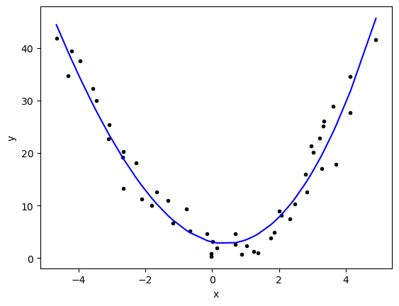
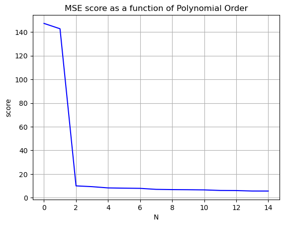
Occams Razor
We want to increase the \(R^2\) value to be as close as possible to \(1\) and decrease the mean squared error to as close as possible to zero, without making our model ridiculously complicated. Stop before you get diminishing returns!
Nvals = np.arange(0,15)
Rscores = []
MSEscores = []

for N in Nvals:

    betas = np.polyfit(x,y,N)


    yfit = 0
    for i,b in enumerate(betas):
        yfit += b*x**(N-i)

    Rscores.append(r2_score(y,yfit))
    MSEscores.append(mean_squared_error(y,yfit))


plt.plot(Nvals,Rscores,'-r')
plt.grid()
plt.title('R^2 score as a function of Polynomial Order')
plt.xlabel('N')
plt.ylabel('score')
plt.show()

plt.plot(Nvals,MSEscores,'-b')
plt.grid()
plt.title('MSE score as a function of Polynomial Order')
plt.xlabel('N')
plt.ylabel('score')
plt.show()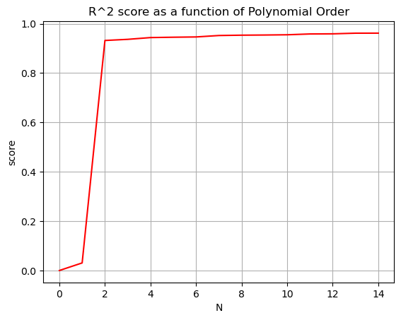
General Idea of Linearized Functions
We could imagine data that has all sorts of dependencies, curves, etc. For example:
\[y = \beta_0 + \beta_1 x + \beta_2 x^2 + \beta_3 \sin(x) + \beta_4 \sqrt{x} \]
as long as we can write the function linearly in beta
\[y = \beta_0 + \beta_1 f_1(x) + \beta_2 f_2(x)+\beta_3 f_3(x)+\beta_4 f_4(x)\dots \]
we can do a linear regression!
BEWARE np.polyfit() can only deal with polynomials, not other more complicated functions!
NOTE Not all functions can be linearized. We have to be able to write it in the form above.
Delhi Climate Data
Here we will look at some climate data and restrict ourselves to just one year to see if we can model the yearly swing in temperature.
- First we will try a polynomial fit
- Then we will see how we could fit a sine function
file_location = 'https://joannabieri.com/mathdatascience/data/DailyDelhiClimateTrain.csv'
DF = pd.read_csv(file_location)

DF.head(10)| date | meantemp | humidity | wind_speed | meanpressure | |
|---|---|---|---|---|---|
| 0 | 2013-01-01 | 10.000000 | 84.500000 | 0.000000 | 1015.666667 |
| 1 | 2013-01-02 | 7.400000 | 92.000000 | 2.980000 | 1017.800000 |
| 2 | 2013-01-03 | 7.166667 | 87.000000 | 4.633333 | 1018.666667 |
| 3 | 2013-01-04 | 8.666667 | 71.333333 | 1.233333 | 1017.166667 |
| 4 | 2013-01-05 | 6.000000 | 86.833333 | 3.700000 | 1016.500000 |
| 5 | 2013-01-06 | 7.000000 | 82.800000 | 1.480000 | 1018.000000 |
| 6 | 2013-01-07 | 7.000000 | 78.600000 | 6.300000 | 1020.000000 |
| 7 | 2013-01-08 | 8.857143 | 63.714286 | 7.142857 | 1018.714286 |
| 8 | 2013-01-09 | 14.000000 | 51.250000 | 12.500000 | 1017.000000 |
| 9 | 2013-01-10 | 11.000000 | 62.000000 | 7.400000 | 1015.666667 |
Plot the data
Always look at a scatter plot of your data!
stop = 365 - restricts us to just one year of data
stop=365
x = np.arange(0,stop,1)
y = DF['meantemp'][:stop]

plt.plot(x,y,'.k')
plt.grid()
plt.show()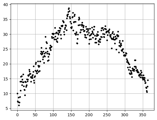
Looking at this data it looks like \(y=-x^2\) (aka. upside down parabola) that has been shifted and stretched to fit the year. We will assume we can fit it with a function of the form:
\[ y = \beta_0 + \beta_1 x + \beta_2 x^2\]
and just use np.polyfit()
betas = np.polyfit(x,y,2)
betas
array([-7.01158700e-04, 2.61972640e-01, 8.12191801e+00])yfit = betas[0]*x**2+betas[1]*x+betas[2]
plt.plot(x,y,'k.')
plt.plot(x,yfit,'b-')
plt.xlabel('x')
plt.ylabel('y')
plt.show()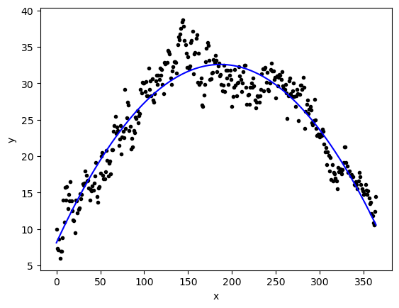
r2_score(y,yfit)0.8946935431841873mean_squared_error(y,yfit)5.765082904243028This worked pretty well!
Polynomial was not our only choice! What if we tried another function? Like sine or cosine?
Using sin(x) to fit our data
What if we want to use \(y=\beta_0 + \beta_1 \sin(x)\) as our nonlinear function that will fit our data? How do we make this work?
First we need to get a better feel for the sine function!
\[y=a\sin(bx)+c\]
a=1
b=1
c=0

xvals = np.arange(0,np.pi*4,0.1)
yvals = a*np.sin(xvals) +c

plt.plot(xvals,yvals,'-b')
plt.grid()
plt.xlabel('x')
plt.ylabel('y')
plt.show()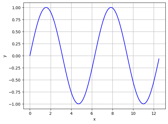
Questions:
- Take a minute and play around with the function plotted above what do \(a\), \(b\), and \(c\) do?
- How often does this function repeat?
How could we take a sine function and shift it to fit this data? We need to make sure we get just one bump!
x_sin = x
y_sin = np.sin((np.pi/365) *x)

plt.plot(x_sin,y_sin,'-b')
plt.grid()
plt.xlabel('x')
plt.ylabel('y')
plt.show()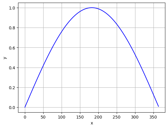
Now we have to do some of the hard work (feature engineering) before we send our data to polyfit. In python we enter
np.sin(np.pi *x /365)to convert our data from \(x\) to our newly engineered data.
We could check to see if there is a correlation between our chosen function of \(x\) and the \(y\) data.
xsin = np.sin(np.pi *x /365)
np.corrcoef(xsin,y)[0,1]0.942399024268974If we applied this function to our data it should look somewhat linear! Here is a plot
# Original Data for one year
stop = 365
x = np.arange(0,stop,1)
y = DF['meantemp'][:stop]

# New feature
xsin = np.sin(np.pi *x /365)

# Plot
plt.plot(xsin,y,'.k')
plt.grid()
plt.xlabel('x')
plt.ylabel('y')
plt.show()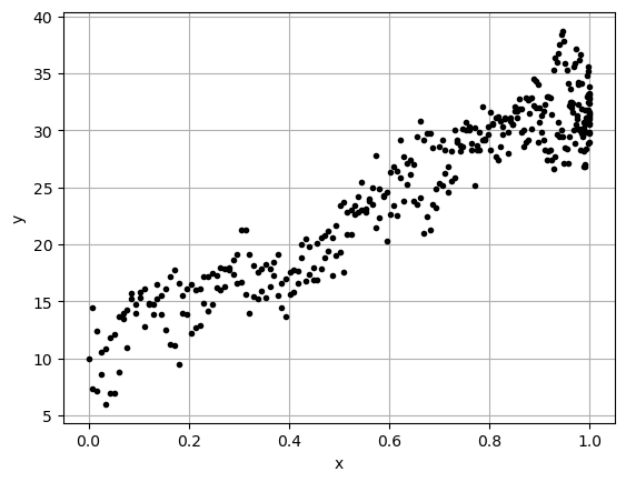
If we do a linear regression with the new feature data we should get a reasonable result.
\[ y = \beta_0 + \beta_1 \sin\left(\frac{\pi x}{365}\right) = \beta_0 + \beta_1 x_1\]
betas = np.polyfit(xsin,y,1)
betas
array([22.6562821, 10.3681457])yfit = betas[0]*xsin+betas[1]
plt.plot(x,y,'k.')
plt.plot(x,yfit,'b-')
plt.grid()
plt.xlabel('x')
plt.ylabel('y')
plt.show()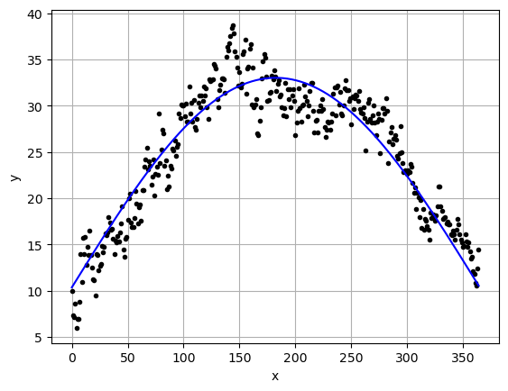
r2_score(y,yfit)0.8881159209431134mean_squared_error(y,yfit)6.125179888598971Both worked so which should we use.
Well Occams razor would say to use the simplest model that fits the data. Which one is simpler?
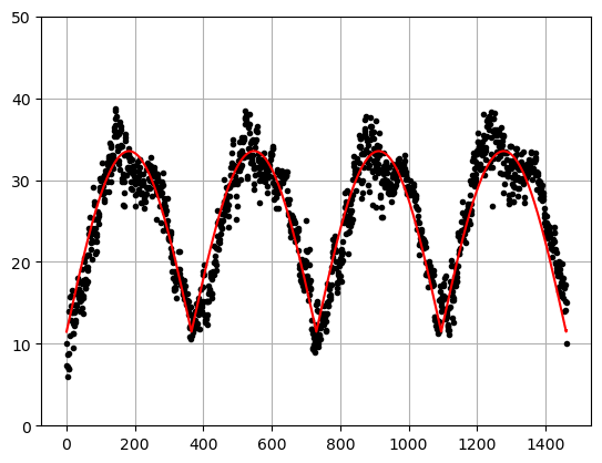
Also, this is a bit of a contrived example because if we look at the data over more years we actually see that neither of our models work very well.
# All of the data
x = np.arange(0,len(DF),1)
y = DF['meantemp']

betaspoly = [-7.01158700e-04,  2.61972640e-01,  8.12191801e+00]
betassin = [22.6562821, 10.3681457]

xsin = np.sin(np.pi *x /365)

ypoly = betaspoly[0]*x**2+betaspoly[1]*x+betaspoly[2]
ysin =  betassin[0]*xsin+betassin[1]

plt.plot(x,y,'.k')
plt.plot(x,ypoly,'-b')
plt.plot(x,ysin,'-r')
plt.grid()
plt.ylim(-50,50)
plt.show()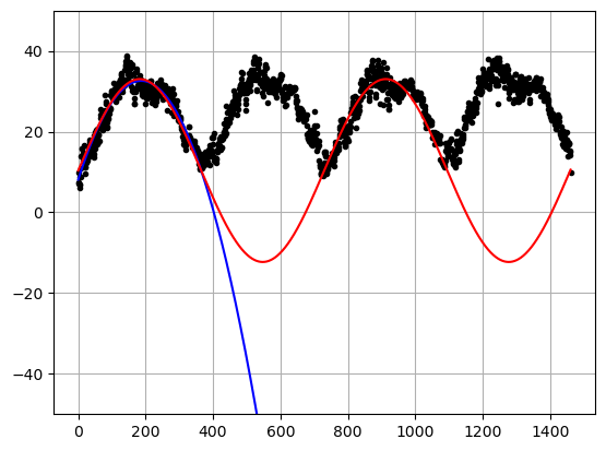
\(R^2\) for the polyfit
r2_score(ypoly,x)-13.02177521007198\(R^2\) for the sin function
r2_score(ysin,x)-2738.8227158184377Large negative \(R^2\) values means that we did a HORRIBLE job of fitting the data!
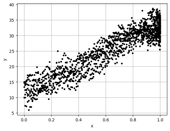
You Try - Due next class
What function should we have tried here?
# Here is your data
x = np.arange(0,len(DF),1)
y = DF['meantemp']
# Here is a plot of your data
plt.plot(x,y,'.k')
plt.grid()
plt.show()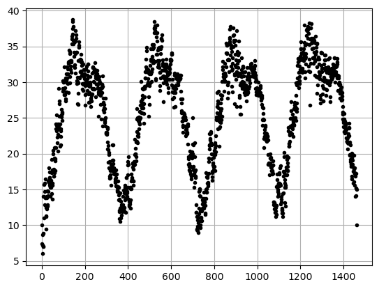
- What function do you propose to really fit the data? HINT - just apply another function to our sine function. There are multiple things that will work better than what we did above!
- Using your choice of function calculate the Correlation Coefficient.
- Create a scatter plot of your function applied to the data (should look kinda linear).
- Do a linear regression with your function applied to the data.
- Plot the regression vs the real data.
- Calculate the \(R^2\) value.
Here is an example of my results - your results are not expected to be identical, but you should have the same parts to the analysis
Correlation Coefficient
0.9261289713860721
----------------------
Plot of my function applied to the data.
----------------------
Wow it looks pretty liner!
----------------------
Plot of my the data and my new regression
----------------------
R-squared Score:
0.8341113893860616